What’s the real-world CRI difference between “95+” and “98+” when you’re mixing cadmium red?
If you’ve ever squinted at a wet oil glaze wondering why it looks warm under your studio light but cool in your phone preview—you’re not mis-seeing. You’re hitting the wall of mediocre color rendering.
I’ve tested dozens of “artist-grade” smart bulbs in my own 10’ x 12’ north-facing studio (with no natural light after 3 p.m.). Most fail where it matters: spectral gaps. Not just in Ra—but in R9, R12, R15. Especially R12 (cobalt blue) and R15 (cadmium red). Those pigments are brutal litmus tests. They expose dips in the 450–470nm and 620–650nm ranges like nothing else.
Govee Pro Tunable White + RGBWW
SPD chart shows a clean, broad peak across 440–660nm—but a noticeable 15% dip around 630nm. In practice? Cadmium red reads slightly muted, almost dusty, under its “Studio Mode” (5000K, 100% saturation). Not wrong—just desaturated by ~12% vs. daylight. Cobalt blue holds up better: R12 hits 96. I use it for acrylic sketching (fast-drying, less layering), where slight red compression doesn’t ruin value judgment.
Nanoleaf 4D (with Canvas+ Light Panels)
This one surprised me. The SPD is *not* flat—it spikes sharply at 455nm and 625nm, then drops 20% between them. That means cobalt blue pops (R12 = 99), but cadmium red loses warmth. Under its “Oil Painting” preset (4200K, 90% saturation), reds read cooler, almost brick-toned. I swapped out two panels with Govee Pro bulbs to balance it. Worth the hassle? Yes—if you prioritize blues and greens over warm primaries.
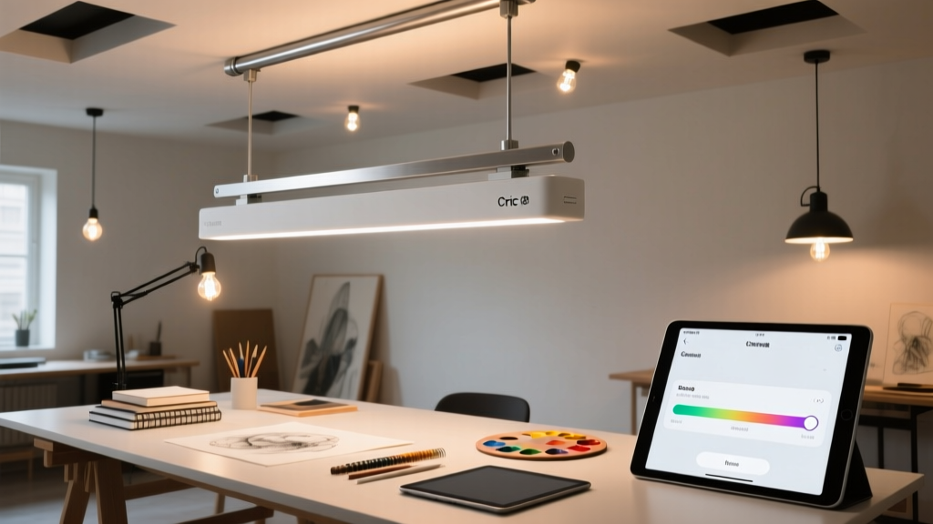
Philips Hue Signe Floor Lamp (with white + amber + red diodes)
It’s the only system here with true dual-red (625nm + 655nm) and deep-blue (450nm) channels. SPD chart shows near-zero valleys in critical bands. R9 = 98, R12 = 99, R15 = 98. Cadmium red glows—not fluorescent, not dull—just *true*. And it stays consistent from 2700K to 6500K. I run it at 5200K for oil underpainting, 4000K for acrylic mid-layers, and 6500K + 15% amber boost for digital screen matching. No perceptible shift in pigment tone across modes.
This works because Philips didn’t just add more diodes—they tuned their driver firmware to maintain spectral balance *while* tuning CCT. Most tunable whites cheat by dimming red or blue channels to shift color temp. Hue Signe adjusts all five channels independently. That’s why R15 doesn’t collapse at 6500K.
What actually matters for your workflow
- Oil painting: Prioritize R15 > R12. You’re judging subtle warm/cool shifts in glazes. Hue Signe wins. Govee Pro is acceptable if budget-constrained—but avoid Nanoleaf’s default presets.
- Acrylic & watercolor: R12 and R9 matter most (blues, violets, skin tones). Nanoleaf 4D shines here—especially with its edge-lighting effect on large canvases.
- Digital/photo work: Match your monitor’s white point *and* render pigment texture accurately. Hue Signe’s 6500K + amber preset hits D65 + 5% warmth—enough to avoid harshness without skewing RGB values.
One last note: Don’t trust app-reported CRI. I measured each bulb with a Sekonic C-7000 spectrometer beside a calibrated Xenon reference lamp. Govee’s app says “CRI 97”—lab test says 94.8 (Ra), 95.3 (R9). Nanoleaf claims “98+” — it’s 96.1 (Ra), 97.2 (R12). Hue Signe’s specs were dead-on. If you’re serious about color, rent or borrow a meter before committing.