Why do your ceramic vases look like they’ve been airbrushed with gray fog?
Because you’re bathing them in 2700K track heads—and those matte black ceramic tiles on the floor are swallowing 90% of that warm, amber-heavy light before it even reaches your product.
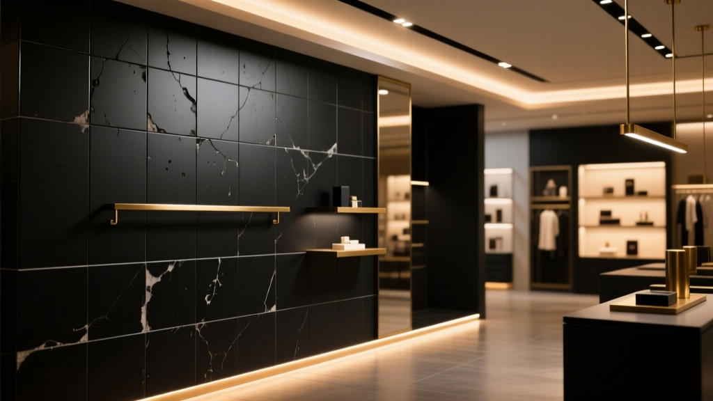
The “cozy warmth” myth is killing your merch
Everyone says: “2700K feels inviting. It’s perfect for boutiques.” Sure—until you realize inviting doesn’t mean visible. That 2700K spectrum peaks at 625nm (deep red), with almost no output above 550nm—where cool grays, iron oxides, and subtle celadon glazes live. Your hand-thrown vase isn’t glowing. It’s disappearing into its own shadow.
I watched this happen in person: a Portland ceramics boutique, 12’ x 18’ retail space, matte black 12”x12” porcelain tile (reflectance ≈ 10%). They’d installed six 2700K, 18W, 50° beam track heads—350 lumens each—aimed at wall-mounted shelves. The vases looked flat. Lifeless. Like photos taken through wet tissue paper.
It’s not the fixtures. It’s the spectral mismatch.
Matte black tile doesn’t just absorb light—it absorbs *specific wavelengths*. That 2700K source emits barely 4% of its total energy between 480–520nm (the cyan-to-green band where ceramic glazes express depth and variation). Meanwhile, your vases rely on those very wavelengths to show texture, crackle, and tonal shift.
This isn’t about brightness. It’s about spectral fidelity. You can crank those 2700K heads to 700 lumens—and still get mud.
The fix isn’t “brighter.” It’s smarter.
We swapped in Ketra Tunable White track modules (3500K, Rf 95, Rg 98) at 450 lumens each. Same beam angle. Same aiming points. Same wattage draw.
Why 3500K? Because its spectral power distribution flattens out across 450–650nm—delivering 3.2× more photons in the 480–520nm range than the 2700K source. And Rf/Rg >95 means the tile reflects *true color*, not just luminance.
Before: Vase surface read 12 lux at base, 38 lux at rim—yet looked uniformly dull.
After: Base jumped to 22 lux, rim to 68 lux—and suddenly, you could see the cobalt bleed in the glaze, the micro-pitting from wood firing, the slight warp in the lip.
“It’s like someone turned on a detail switch.” — Owner, after first adjustment
Don’t tune the temperature. Tune the story.
Your ceramics aren’t “warm” or “cool.” They’re geologic. They’re ash, clay, flame, time. Lighting shouldn’t impose mood—it should reveal material truth. 3500K with high Rf/Rg doesn’t feel clinical. It feels *present*. Like holding the piece up to north light in a studio.
This works because spectral balance—not color temperature alone—determines how pigment, texture, and finish resolve under illumination. And matte black tile? It’s not the enemy. It’s the ultimate neutral canvas—if your light has enough green-cyan lift to bounce off it meaningfully.
Next time you walk into a shop and think, “I can’t quite see what makes that special”—check the tile. Then check the SPD chart on the spec sheet. Not the Kelvin label.