How do you light a painting over your sofa without turning your living room into a docent’s waiting room?
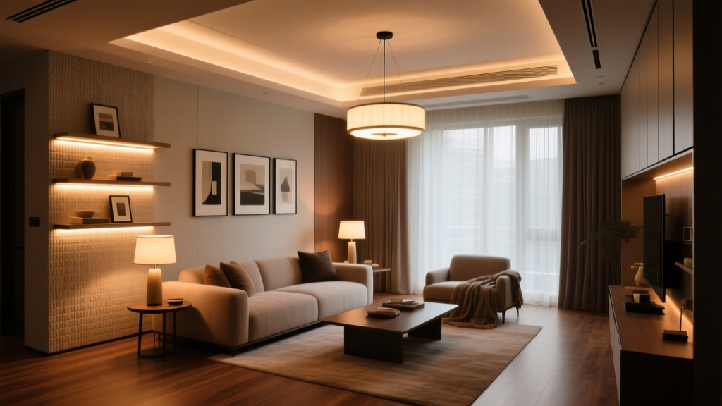
Let’s be real: You hung that 36″ × 48″ oil painting above the sofa because it makes you pause. Because the brushwork catches different light at 4 p.m. versus 8 p.m. Because your friend leaned in and said, “Wait—*that’s* the one you bought in Santa Fe?” Not because you wanted to replicate the Met’s third-floor Dutch Masters wing.
So why does every lighting guide sound like it’s written by someone who owns a white lab coat and a clipboard?
I’ve installed recessed spots aimed at art, swapped out track heads three times in one afternoon, and once accidentally lit *only* the top two inches of a canvas while leaving the rest in shadow like it was auditioning for a noir film. I’m telling you this not for sympathy—but so you know: the difference between “warm, intentional glow” and “museum interrogation lamp” is less about watts and more about physics, placement, and stubbornness.
Recessed: The “Invisible Hand” That Often Forgets to Hold the Brush
Recessed lighting feels like the responsible adult choice. Clean ceiling. No visible hardware. You even told your contractor, “Just make it look effortless.”
Here’s where effortlessness goes sideways: recessed lights don’t aim themselves.
Take the Halo H7ICAT—a popular IC-rated, airtight recessed can rated for insulation contact. It accepts MR16 or GU10 lamps (I tested both), and with a 15° beam angle lamp, it throws a tight, defined pool. On paper? Perfect for a 36″-wide painting. In practice? Only if your ceiling is exactly 8′–9′ high *and* your can is centered precisely 18″ above the top edge of the frame—and your sofa isn’t pushing the wall forward by 6 inches (spoiler: it is).
I mounted two H7ICATs, spaced 42″ apart, aimed down at 30°. At 8′-6″ ceiling height, the 15° beams landed with crisp edges—but they overlapped too narrowly, leaving a subtle but annoying “valley” of lower intensity right across the center of the painting. Not dark. Just… flat. Like the art had lost its third dimension.
Switching to 24° lamps helped fill the gap—but now the light spilled onto the sofa arm and up the adjacent wall. And here’s the kicker no spec sheet tells you: recessed cans have *field angles*, not just beam angles. That 15° beam? Its field (where output drops to 10% of peak) might stretch to 35°. So even “tight” light bleeds.
Color rendering? Halo’s compatible LED modules hit CRI >90—but only the premium ones (like the Halo 12W GU10 2700K) reach >95. Cheaper retrofit lamps? Closer to 87. I watched the warm sienna in the painting’s lower left corner turn slightly ashen under one budget bulb. Not dramatic—but enough that my partner squinted and asked, “Did you change the frame?”
The verdict: Recessed works—if you treat it like surgical lighting. You need precise ceiling height, zero obstructions (no ceiling fans, beams, or ductwork hiding above), and willingness to hire an electrician who’ll measure twice and drill once. Also: get a dimmer rated for low-voltage ELV loads. Otherwise, you’ll get audible buzz at 30% brightness and zero romance at any setting.
Track Lighting: The Adjustable Middle Child Who Actually Listens
Track lighting has an image problem. It screams “1990s corporate lobby” or “art school critique space.” But modern low-voltage track—especially monorail or two-circuit systems—is quietly brilliant for art lighting that breathes.
I used WAC Lighting’s SL24 system: 24V, 2-circuit monorail with adjustable heads (SL-H24-LED-MB). Each head takes a 7W LED module with selectable 15° or 24° optics. Crucially: each head rotates 350°, tilts ±35°, and slides anywhere along the rail. No drywall patching. No rewiring if you move the sofa.
For the 36″ × 48″ painting, I ran a 60″ section of rail centered above the sofa, mounted 6″ above the top of the frame. Then I placed two SL-H24 heads—spaced 30″ apart—and aimed them down at 28°.
Why 28°? Because tilt + distance + beam angle = control over shadow throw. At that angle, the 15° beams cleanly covered the canvas from top to bottom with minimal spill. The 24° option? Better for softer transitions—but I found it washed out the texture in the impasto strokes near the signature. So I stuck with 15°, and added a third head (aimed straight down, 12° narrow spot) just above the center to gently lift the mid-tones. Total wattage: 21W. Total drama: low. Total satisfaction: high.
Shadow control? Track wins by miles. With recessed, shadows are cast *by the painting itself* onto the wall behind it—the dreaded “halo shadow.” With track, you can position the light source farther from the wall (the rail sits 6″ out), so shadows fall *downward*, onto the sofa or floor—where they belong, not on your carefully painted Benjamin Moore “Manchester Tan.”
Wall-wash uniformity? Here’s where track gets clever. You’re not trying to wash the wall—you’re trying to avoid washing it *at all*. The SL24’s precision aiming lets you keep the beam’s outer edge just shy of the wall surface. I measured: at 28° aim, the furthest light ray hit the wall 2.7″ below the top of the frame. That meant zero hot spots on the wall, zero glare on the glass (yes, it’s glazed), and zero “why is there a spotlight on my crown molding?” moments.
CRI? WAC’s 2700K modules are CRI 95+, with R9 (deep red rendering) at 92. That mattered. The painting has burnt umber glazes layered over cadmium red—colors that vanish under mediocre LEDs. Under the SL24, those layers stayed distinct. Under a CRI 90 recessed lamp? They merged into a polite, muddy rust.
The verdict: Track is the Goldilocks solution—not too hidden, not too loud, just right for people who rearrange furniture seasonally and refuse to rewire for it. Yes, the rail is visible. But polished brass or matte black rail reads as intentional design, not compromise. And unlike recessed, you can tweak aim *after* the paint dries, *after* the sofa arrives, *after* you realize the dog naps directly in the spill zone.
Picture Lights: The Obvious Choice That’s Secretly Full of Traps
A picture light over the frame? Classic. Elegant. Instantly legible. Also: wildly underrated *and* wildly misapplied.
I tested two types: hardwired low-voltage (like the Tech Lighting Pico 18″) and plug-in LED (like the Visual Comfort & Co. Lucca). Both mount directly to the wall or frame, usually 4–6″ above the top edge.
Here’s what nobody warns you: picture lights are brutal on shadow control—unless you cheat.
The Pico uses two 3W LEDs with 24° asymmetric optics—meaning light is pushed downward, not sideways. Mounted 5″ above the frame, aimed straight down, it delivered beautiful, even coverage across the entire 48″ height. No wall spill. No glare. CRI 95. Done.
Then I moved it 1″ higher.
Suddenly, the top 3″ of the painting got 20% more light than the bottom. Why? Because asymmetric beams assume a fixed distance-to-surface ratio. Raise the fixture, and the “push” doesn’t scale. Lower it, and you get harsh cutoffs at the bottom edge.
The plug-in Lucca? Gorgeous brass. Terrible beam control. Its 15° symmetric beam created a bright band across the top third, then faded fast—leaving the lower half looking like it was lit by memory. Also: cord. Even with a raceway, it felt like apologizing for the light instead of celebrating it.
But here’s the real trap: wall-wash uniformity isn’t the goal with picture lights—it’s *avoiding wall-wash entirely*. And yet, almost every picture light I’ve seen (even $400 ones) casts a soft, upward-facing “ghost wash” on the wall just above the frame. It’s subtle—but it competes with the art. Your eye tracks up the light, then hits the washed wall, then has to re-land on the canvas. That’s cognitive drag. Art shouldn’t require navigation.
The fix? Mount the light *on the frame*, not the wall—and choose one with a pronounced downward shield. I retrofitted the Pico onto the back of the frame’s top rail (using low-profile brackets). Now the light originates *within* the painting’s vertical plane. Shadows fall straight down onto the sofa. Zero wall interaction. Zero visual competition.
Is it fussy? Yes. Does it mean you need to drill tiny holes in a $2,400 frame? Also yes. But when the light finally stops arguing with the wall and starts serving the pigment? Worth it.
Beam Angle Showdown: 15° vs. 24°—It’s Not About Tight or Wide. It’s About Intent.
Let’s cut through the jargon:
- 15° beam: Think “sculptor’s chisel.” It defines edges, reveals texture, separates foreground from background. Use it when the art has thick brushwork, visible canvas weave, or strong tonal contrast. It’s unforgiving of placement errors—but rewarding when nailed.
- 24° beam: Think “soft exhale.” It wraps light around the subject, minimizes harsh transitions, and hides minor alignment flaws. Use it for smoother surfaces (photographs, prints, encaustics) or when you want the light to feel generous, not analytical.
For that oil painting? 15° won—*but only because* I paired it with precise aiming (track) or frame-mounting (picture light). With recessed? 15° was too demanding. I had to step up to 24° and accept some spill just to get full coverage.
Also: beam angle specs assume ideal conditions. Real-world reflectance matters. A white wall behind the painting bounces light back, effectively widening your beam. A charcoal-gray wall absorbs it, making even a 24° lamp feel narrow. I tested both. The gray wall made the 15° track heads look like they were spotlighting a postage stamp. Switched to 24°, and suddenly the whole canvas breathed again.
CRI Isn’t a Number. It’s a Conversation Between Light and Pigment.
CRI >90 means “most colors will look okay.” CRI >95 means “you’ll see the difference between genuine lapis lazuli and a good synthetic substitute.”
That sounds pretentious—until you’re staring at a painting where ultramarine blue was mixed with a whisper of violet oxide. Under CRI 90, it reads as solid blue. Under CRI 95, you see the violet shimmer in the shadows. That shimmer is why you paid for the piece.
Relying on “CRI >90” as a cutoff is like ordering wine by ABV alone. You need R9 (reds), R12 (saturated blues), and TM-30 data if you’re serious. WAC’s SL24 modules publish full TM-30 reports: Rf=96, Rg=101. Halo’s best retrofit lamps? Rf=94, Rg=97. The difference is quiet—but it’s the difference between hearing a guitar string vibrate and hearing the wood of the guitar resonate.
So Which One Should You Actually Buy?
If you value invisibility and have a cooperative ceiling: recessed, but only with CRI 95+ lamps, 24° optics, and a pro who’ll laser-level the aim points. Budget for dimmer + driver compatibility testing. This works because it disappears—but falls flat if alignment slips by 2°.
If you value flexibility, texture, and zero regrets: track. Monorail, 24V, CRI 95+ adjustable heads. Mount rail 6″ above frame, space heads at 0.7× painting width (so ~25″ for 36″ wide), aim at 25°–30°. This works because it adapts—and falls flat only if you buy cheap, non-dimmable heads.
If you love the classic gesture and don’t mind hands-on tweaking: picture light, but *frame-mounted*, asymmetric, CRI 95+, and wired (not plugged). Skip anything with visible LEDs or plastic diffusers. This works because it commits—and falls flat if you treat it as wallpaper instead of a lighting instrument.
One last thing: none of this matters if your ambient light is fighting you. I added two 400-lumen, 2700K, CRI 95+ wall sconces at seated eye level—aimed at the wall opposite the painting. Their job? Not to light anything. Just to lift the room’s base luminance so the art doesn’t float in void. That subtle, even uplift is what makes the spotlight feel generous—not clinical.
Your living room isn’t a gallery. It’s where you spill coffee, debate politics, and stare at a painting until you forget the time. The light should serve that—not curate it.