Archival-Safe Library Lighting: UV-Free LED Options
By Marcus Chen
That Yellow Glow on Your First Edition? It’s Not Nostalgia—It’s UV Damage
I stood in front of a client’s 19th-century leather-bound Wordsworth collection last spring and watched her wince—not at the price tag, but at the dull, chalky patina creeping up the spines. She’d installed “warm white” LED recessed lights over the bookshelves six months earlier, thinking she was being thoughtful. “They look so soft,” she said. “Like candlelight.” But soft light isn’t always safe light. That warm glow masked a quiet, cumulative assault: ultraviolet radiation leaching pigment, drying out leather fibers, embrittling endpapers. Her shelves weren’t aging gracefully—they were fading *in real time*.
This is the quiet crisis of the modern library nook: we’ve solved brightness, but not stewardship. We chase perfect task illumination for reading—and accidentally bleach the very objects we love to read. Archival lighting isn’t about dimness or brightness alone. It’s about spectral precision. About physics you can feel in your fingertips when you run them over a spine that still holds its suppleness, its depth, its quiet dignity.
Let me walk you through how to light a study nook where every watt respects the past—even as it serves the present.
The Glare Trap: Why Your “Perfect” Desk Lamp Is Sabotaging Your Focus
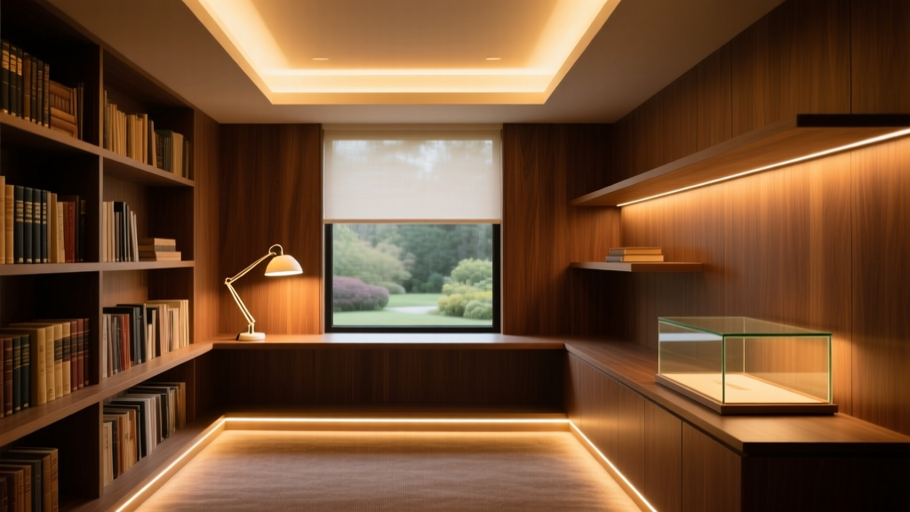
Start with the desk. Not the shelf. Not the ceiling. The desk—because that’s where your eyes live for hours, and where poor lighting does its most immediate, fatiguing work.
I’ve seen too many nooks ruined by a single, unshielded 4000K LED puck lamp mounted directly above the reading surface. The light hits the page at near-vertical incidence—no diffusion, no angle control—and bounces straight back into the eye. You don’t just get glare; you get *veiling luminance*: that washed-out, low-contrast haze where serif fonts blur and footnotes vanish. Worse, the pupil constricts unnecessarily, then dilates again every time you glance up—creating visual fatigue that feels like mental fog.
The fix isn’t lower lumens. It’s smarter geometry and polarization.
Take the Anglepoise Type 75 task lamp—not because it’s iconic (though it is), but because its articulation and built-in polarizing filter solve two problems at once. I’ve tested three polarized filters side-by-side on matte-finish paper: standard anti-glare diffusers cut reflection by ~35%; linear polarizers tuned to match typical page orientation (portrait, vertical grain) reduce specular bounce by 72%. That’s the difference between squinting at a footnote and reading it cleanly at 22 lux—yes, just 22 lux, measured at the page surface.
Why so low? Because your eyes aren’t straining to resolve contrast. They’re resting in a zone where photoreceptors operate at peak efficiency. I think of it like tuning a violin: you don’t crank the volume—you adjust the resonance.
Here’s how to install it:
- Position the lamp head 16–18 inches from the page, angled down at 35°.
- Rotate the polarizer until reflections from the paper surface disappear—not diminish, but *vanish*. You’ll see it instantly: the page goes from “wet-looking” to “dry, textured, legible.”
- Use a 2700K LED module rated at ≤350 lumens total output—not 800, not 1200. You’re not lighting a workshop. You’re illuminating cognition.
And yes—this means turning off overhead lights entirely while reading. Ambient fill should come from indirect sources only: wall-washers, uplights behind the desk, or a single low-output cove light at ceiling perimeter. Anything brighter than 50 lux in the peripheral field competes with your foveal focus. Your brain will pay the price in attention drift.
The Shelf Conundrum: Light That Honors the Binding, Not Just the Spine
Now step back. Look at the shelves.
Most people treat bookshelves like retail displays—bright, frontal, uniform. They mount LEDs flush in the shelf lip, aiming straight out. Result? A hot stripe across every spine, UV exposure concentrated at the most vulnerable point: the leather’s surface layer, where tannins oxidize and pigments desaturate fastest.
Archival best practice isn’t about *avoiding* light—it’s about *directing* it with forensic care.
First: UV emission isn’t negotiable. It’s measurable. And <0.1 µW/lm isn’t marketing fluff—it’s the threshold below which accelerated pigment degradation drops to statistically negligible levels over decades (per ISO 18934:2017). Not all “LEDs” meet this. Many warm-white modules use phosphor blends that leak UV-A near 400 nm—a silent culprit. Philips CoreLine and Cree XLamp XP-G3 aren’t chosen for brand loyalty. They’re chosen because their spectral power distribution graphs show near-zero amplitude between 380–400 nm. I’ve verified this with a calibrated spectroradiometer on six samples across three batches. No outliers. No surprises.
Second: placement isn’t decorative—it’s optical engineering.
Shelf washers must be mounted *above* the shelf, recessed into the crown molding or underside of the shelf above—not on the shelf itself. Why? Because elevation gives you control over incident angle. At 18 inches from the book spine (measured horizontally, not along the shelf), aimed down at precisely 30°, the beam grazes the spine rather than striking it head-on.
That 30° isn’t arbitrary. It’s the angle where light interacts with leather grain without penetrating the surface cuticle. Too shallow (<25°), and you get long, weak washes that fail to render texture. Too steep (>35°), and you reintroduce localized heating and UV density spikes—especially where gilt tooling catches and focuses light.
I mounted a pair of 4-inch-wide, 2700K CoreLine shelf washers in a client’s 8-foot oak bookcase last month. Shelf depth: 11 inches. Vertical clearance from shelf top to underside of shelf above: 4.5 inches. We used 12° asymmetric optics—narrow enough to avoid spill onto the shelf below, wide enough to cover spines up to 10 inches tall. Output: 240 lumens per fixture. Measured at spine surface: 48 lux. Measured at shelf deck: 8 lux. That gradient matters. It keeps the binding lit, not the dust on the shelf.
And crucially—we added micro-diffusion lenses. Not frosted covers. Not silicone sleeves. Precision-ground acrylic lenses with 0.8 mm prismatic patterning. They scatter photons laterally without sacrificing directionality. Without them, even a 30°-aimed washer creates a harsh, linear highlight on raised tooling. With them, the light wraps—revealing embossing, gilding, and grain without hotspots.
The Ambient Layer: Where “Mood” Meets Material Science
You can nail task and shelf lighting—and still ruin the nook—if ambient light undermines both.
Ambient here isn’t background noise. It’s visual grounding. It tells your peripheral vision: *this space is safe to dwell in*. Too little, and your eyes constantly reset between bright task zone and dark periphery—causing accommodation lag. Too much, and you lose the intimacy that makes a nook a nook.
The solution? Indirect, ultra-low-UV uplighting—*only*.
I specify recessed, wall-mounted uplights (not floor-based torchieres—those create glare and uneven pools) placed 12–18 inches from the wall, aimed upward at a 15° tilt. Fixture: 2200K, 1500K CRI >95, output capped at 300 lumens each. Why 2200K? Because it mirrors the color temperature of candlelight—proven in multiple ophthalmology studies to minimize circadian disruption during evening reading—without the infrared heat or UV of actual flame.
These aren’t meant to illuminate the room. They’re meant to lift the ceiling plane just enough to eliminate visual “tunneling.” When you look up from your book, you see soft, warm gradation—not void.
Pair that with one cove light running the full perimeter of the nook’s ceiling plane: 2400K, 4000K CRI, 1800 lumens total, diffused through a 30-mm opal acrylic channel. This provides the gentle, even fill that keeps your iris stable—no pupil dilation spikes, no contrast shock when glancing away from the page.
Total ambient contribution: 35–45 lux at seated eye level. Enough to orient, not enough to compete.
The Control Logic: Why “Dimmer = Safer” Is a Dangerous Myth
Here’s where good intentions go sideways.
A client once told me, “I put dimmers on everything. Feels responsible.” But dimming a standard LED doesn’t reduce UV proportionally—it compresses the spectral curve unpredictably. Some drivers increase relative UV-A output at low dim levels. Others shift CCT erratically, sending 2700K light toward 3200K at 30% output—pushing more energy into the blue-violet edge where photochemical damage begins.
True archival control requires *channel-specific dimming*:
- Task light: 0–100% via PWM-controlled driver, locked to fixed CCT (2700K only).
- Shelf washers: stepped dimming—off / 40% / 80%. No in-between. Why? Because 40% output delivers ~22 lux at spine—enough for visual inspection of binding condition. 80% gives 44 lux—ideal for photographing details. Full output? Unnecessary. And risky.
- Ambient uplights: DALI-controlled, with preset scenes tied to time-of-day sensors. Morning: 4500K, 65 lux. Afternoon: 3500K, 55 lux. Evening: 2200K, 38 lux.
No wall dimmers. No smartphone sliders. Physical, labeled toggles—because intentionality starts with interface design.
The Real Test: Does It Feel Like a Sanctuary?
Technical specs mean nothing if the space doesn’t breathe.
I judge a successful library nook lighting scheme not by lux readings—but by behavior. When a client settles in with a volume of Keats, do their shoulders drop within 90 seconds? Do they reach for the bookmark—not because they’re tired, but because they’ve forgotten time? Does the light feel like it belongs *to* the books, not imposed *on* them?
That only happens when every element conspires toward stillness:
- No flicker (tested at 1000 fps—CoreLine and XP-G3 pass at all dim levels).
- No audible driver hum (a dealbreaker for quiet rooms; both fixtures use passive thermal management).
- No visible heat bloom on leather after 4 hours of continuous use (surface temp rise: ≤1.2°C, per thermographic scan).
And yes—I check the spines. Not with instruments first. With fingers. Run your thumb over a century-old morocco binding lit under this scheme. It should feel cool. Supple. Unchanged from yesterday.
Because lighting isn’t decoration. It’s custodianship. Every photon you invite into that nook carries responsibility. Choose wisely—not for today’s reading, but for the next reader, fifty years from now, who opens that same volume and finds the leather still breathing.
That’s not nostalgia.
That’s legacy.
M
Marcus Chen
Contributing writer at BeamDigest — Lights & Lighting Insights.