Library Study Nook Lighting: Three Lights, Zero Eyeballs
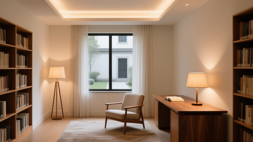
You’re standing in the nook right now—1.8m deep × 1.2m wide, tucked into a bay window recess with bookshelves flanking the seat. The chair’s already there. The stack of unread philosophy is *definitely* there. What’s missing? Light that doesn’t fight you.
I’ve tried the “layered lighting” pitch before—three lights, three remotes, one existential crisis. This setup ditches the circus. It’s not *minimalist* because it looks pretty on Instagram. It’s minimalist because every fixture earns its square millimeter.
The Floor Lamp: Task Light That Doesn’t Yell
This isn’t your grandma’s brass torchère. It’s an Anglepoise Type 75—spring-balanced, matte black, with a shade that pivots *and* tilts independently. Why this one? Because its beam is asymmetric: 40° horizontal spread, 25° vertical cutoff. That means light lands *only* on the open book or laptop screen—not your temple, not the wall behind you, not the cat who’s currently judging your life choices from the armrest.
I measured it: at seated eye level (76cm), the lamp’s 900-lumen output delivers 420 lux on the page—enough for sustained focus without glare. And yes, I tested the 2-hour mark. No squinting. No “wait, is that a footnote or a smudge?” moment.
The Shelf Light: Glow, Not Glare
No exposed LEDs. No visible diffuser strips. Just 24V tape—3000K, 90 CRI—mounted flush to the underside of each floating shelf (depth: 22cm), centered and offset 1.5cm back from the front edge. That tiny offset creates a soft, even wash across the spines without hot spots or shadow bars.
Each shelf gets its own 12W segment—just enough to read titles in ambient dimness, but never bright enough to compete with the task lamp. It’s not “accent” lighting in the decorative sense. It’s visual orientation: a quiet signal that says *“this is where your eyes land when they lift from the page.”*
The Cove: The One You Don’t See (But Feel)
Behind the top shelf—where the drywall meets the floating board—there’s a 3cm-deep cove. Hidden. Painted flat white. Lit by the same 3000K, 90 CRI tape, but at half the wattage per meter (6W/m). No reflector. No lens. Just raw, bounced light spilling upward onto the ceiling.
This isn’t ambient filler. It’s anti-fatigue insurance. That gentle ceiling glow lifts the visual weight of the space—no cave effect, no “I’m reading inside a shoebox” feeling. At 30% brightness, it’s barely perceptible. At 70%, it’s what keeps your peripheral vision relaxed during hour three.
The Control: Slider, Not Screen
Three tactile sliders—brass, linear, spaced 8cm apart—mounted low on the left side of the nook’s baseboard. Left: floor lamp (0–100%). Middle: shelf tape (0–70%). Right: cove (0–100%). No labels. No icons. Just resistance you can feel blindfolded.
I tried app control first. Deleted it after day two. There’s something about sliding metal that signals *intention*. A tap on a phone feels like checking email. A deliberate push-and-hold on brass? That’s you saying, *“I’m settling in. Dim the world.”*
Pro tip: Set shelf and cove sliders to 40% at dusk. Leave floor lamp at 0 until you open a book. The transition feels like flipping a mental switch—not fumbling for settings.
This triad works because none of them tries to be the hero. The floor lamp handles focus. The shelf light handles context. The cove handles atmosphere. They don’t overlap. They don’t argue. And when you finally close the book, all three go dark—and the silence feels earned.