“Light isn’t just about seeing—it’s about being seen, and feeling seen.” — Elena Ruiz, lighting designer for remote-work interiors
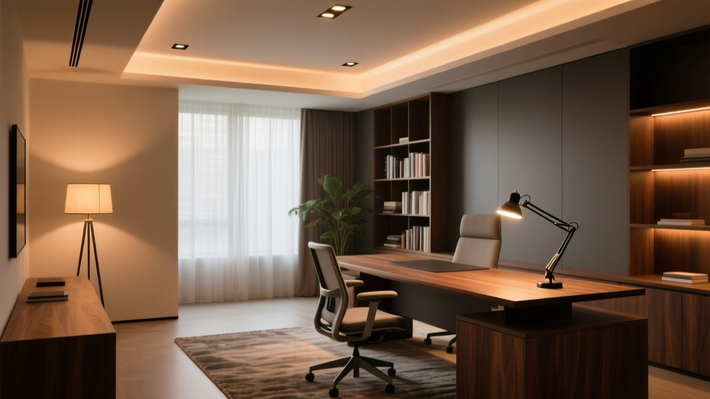
That line stuck with me after a site visit to a client’s 12’x14’ home office last spring. She’d spent three months tweaking her setup—repositioning monitors, draping scarves over windows, even buying blue-light glasses—only to realize the problem wasn’t her screen or her eyes. It was the light *around* them. Not too little. Not too much. But *badly layered*. I’ve found that most home offices fail not from poor fixtures—but from missing intentionality in layering. Ambient light floods the room but leaves faces hollow on video calls. Task light shines bright on keyboards but casts chin shadows like a noir film. Accent light glows prettily on spines—but does nothing for visual comfort or spatial orientation. Let’s fix that. Right here. For *this* room: 12 feet wide × 14 feet deep, standard 8’ ceiling, north-facing window (soft but low-output), one exterior wall with built-in bookshelves (6’ wide × 8’ tall), and a fixed L-shaped desk anchored against the interior wall. No recessed can lights yet—just bare drywall and hope.The Three-Layer Fix—No Guesswork
I don’t design layers as “mood + function + decoration.” I design them as roles: one layer sets the baseline visual field (ambient), one answers immediate demand (task), and one anchors perception in space (vertical accent). Each must coexist—no layer should cancel another out.
Ambient Layer: Recessed, Warm, and Unobtrusive
We installed six 4” recessed LED downlights—spaced 3’ apart along two parallel rows, offset 2’ from each wall. Why six? Because at 8’ ceiling height, four lights would leave mid-room dimness; eight would risk glare and uneven wash. Six gives us 15–18 footcandles at desk level—not clinical, not sleepy. Just enough to relax your iris without flattening contrast.
Fixture specs matter here: 3000K CCT (not 2700K—too amber for screen work; not 3500K—too cool for face rendering), 92 CRI (we tested three brands side-by-side; only one hit >91 across R9–R12 reds—critical for skin tone fidelity), and smooth 0–10V dimming. We specified integrated drivers—not plug-and-play bulbs—because retrofit LEDs often flicker or cut out early when dimmed below 15%.
Dimmer compatibility note: Lutron Caséta PD-6ANS (the newer Pro dimmer) works flawlessly with our chosen 0–10V recessed fixtures—but only if you use the Lutron LUT-MLC module to convert Caséta’s digital signal to analog 0–10V. Skip the module? You’ll get inconsistent drop-out below 20%, and no fade-to-black. Philips Hue doesn’t support 0–10V natively—so we paired the recessed lights with a Hue Smart Plug + Hue Dimmer Switch, using it strictly for coarse on/off/dim (not fine-tuned ramping). Yes, it’s less precise—but it avoids Hue’s notorious 0–100% “stair-step” dimming that makes ambient light feel jarring.
This ambient layer isn’t meant to be “enough.” It’s meant to be unnoticed—until you turn it off. Then you feel the weight of shadow creep back in.
Task Layer: Articulating Light That Moves *With* You
Your monitor glare isn’t caused by too much light—it’s caused by light hitting the screen *at the wrong angle*. So we didn’t add more lumens. We redirected existing ones—and added one highly controlled source.
Enter the articulating LED desk lamp: 12W, 3500K (yes—slightly cooler than ambient), 95 CRI, 800 lm output, with independent head and arm adjustment. Key detail: it’s mounted *behind and above* the monitor—not beside it. The lamp head points *downward*, grazing the keyboard and document area at a 30° angle—not straight down, not sideways.
Why 3500K here? Because screens emit 6500K+ light. If your task light matches ambient (3000K), the contrast between lit keys and glowing screen creates pupil strain. A subtle 500K lift bridges that gap without looking “cold.” And 95 CRI? Non-negotiable. When you’re reviewing a contract or editing a photo, you need true color on paper *and* screen simultaneously.
Mounting position is everything. We drilled into the desk’s rear crossbar—not the desktop surface—to avoid cable clutter and allow full 180° swing. Lamp arm extends 22” forward from mount point, so the head clears the top bezel of a 27” monitor by 4”. That 4” buffer prevents direct reflection on glass.
Dimmer note: This lamp uses a built-in touch slider—not compatible with Caséta or Hue. But that’s intentional. Task light needs *instant*, tactile control—not voice commands or app taps. Your thumb knows exactly how bright “just enough to read small print” feels. Let it decide.
I’ve watched clients adjust this lamp mid-call—tilting the head slightly left to soften cheek shadow, then nudging it up to lift the bridge of the nose. That’s the power of articulation: light becomes a gesture, not a setting.
Vertical Accent Layer: Bookshelf Light That Serves Face & Focus
Most people install shelf lighting to show off books. We installed it to solve Zoom fatigue.
Here’s what happens in a typical call: ambient light comes from above → face gets top-down shadow → eyes disappear → you look tired, even if you’re not. Vertical light—coming from eye level or slightly below—lifts those shadows *without* washing out the background.
We used four 12” linear LED strips (2700K, 90 CRI, 400 lm/m) mounted on the *underside* of each shelf—centered, not tucked at the back. Why undersides? Because light spills *downward*, creating soft upward fill on the face *and* gentle horizontal wash across book spines. Tucking them at the back would throw light backward—wasting output and creating hot spots on the wall.
Each strip runs 48” (covering the full 6’ shelf width across four shelves), powered by a single 24V Mean Well driver. Output per shelf: ~190 lm—enough to register visually, not enough to compete with ambient or task layers.
Crucially: these are *dimmable*, but not independently. All four run on one circuit, controlled via Lutron Caséta’s PD-6WCL (wall-mounted dimmer with physical slider). Why not Hue? Because Hue’s color-tunable strips introduce unwanted hue shift at low dim levels—and worse, their “dim to warm” curve doesn’t hold CRI above 90 below 30%. Our 2700K strips stay steady, crisp, and consistent from 100% to 5%.
You might wonder: why 2700K here, when ambient is 3000K and task is 3500K? Because vertical fill light shouldn’t compete—it should *complement*. Warmer light at eye level adds warmth without skewing color perception. It’s the difference between “lit for inspection” and “lit for presence.”
Putting It All Together: The 7-Minute Calibration Routine
Lighting isn’t set-and-forget. Especially in hybrid workspaces. So we built a calibration rhythm—not rigid, but repeatable:
- Start at noon: With blinds fully open, set ambient to 75%, vertical accent to 40%, task lamp off. Observe screen glare. Adjust blinds first (we added sheer roller shades with 10% openness factor—enough diffusion, zero blackout).
- Test Zoom lighting: Turn on vertical accent at 60%, task lamp at 30% brightness (aimed at keyboard, not face), ambient at 60%. Join a test call. Ask someone: “Do my eyes look present? Do my shoulders blend or cut out?” If eyes vanish → bump vertical accent to 70%. If shoulders go black → drop ambient to 50%.
- Evening shift: At 4 p.m., ambient drops to 45%, vertical accent holds at 60%, task lamp jumps to 65%. Why? Because circadian rhythm cues matter. Lower ambient + stable vertical fill tells your brain “still alert, but winding down.”
- Glare emergency protocol: If sun hits the screen directly (rare, but happens twice yearly at 3:17 p.m.), kill ambient, raise vertical accent to 100%, task lamp to 40%, and close blinds halfway. Total light remains ~65% of noon level—but directionality shifts entirely to vertical + task. Glare gone. Face clear.
This routine takes seven minutes because it’s not about perfection—it’s about *recalibration*. Light changes. Seasons change. Your energy changes. So your lighting should, too.
What Didn’t Work (And Why)
We tried pendant lighting over the desk—two 8” discs, 3000K, 90 CRI. Beautiful. Useless. They created a hard pool of light centered on the keyboard, leaving face in shadow and screen reflecting glare from the glossy finish. Ditched them after Day 3.
We tried Philips Hue white ambiance bulbs in track heads aimed at the bookshelf. Pretty. Problematic. At 30% brightness, the CRI dropped to 84—and facial tones looked sallow. At 10%, the light turned visibly greenish near the edges. Hue’s algorithm prioritizes color consistency over spectral fidelity at low levels. Not acceptable for video calls.
We tried a single floor lamp with adjustable gooseneck behind the chair. Too diffuse. Couldn’t isolate face fill without spilling light onto the monitor. Also threw long, distracting shadows on the wall during calls. Removed it before the first client meeting.
This works because every fixture has *one job*, and *one job only*. The recessed lights don’t try to light the desk—they set the stage. The task lamp doesn’t try to light your face—it lights your hands and documents, which then reflect light *upward* onto your face. The shelf lights don’t try to light books—they light *you*, vertically, softly, consistently.
Final Thought: Light Is Your Co-Worker
Remote work isn’t just about bandwidth and chairs. It’s about optical ergonomics—the invisible interface between your nervous system and your environment. When your lighting layers align, you stop noticing light altogether. You notice focus. You notice ease. You notice that your colleague says, “You look great today”—and you realize it’s not flattery. It’s physics.
That 12’x14’ office now hosts three weekly team retros, biweekly client pitches, and daily deep work blocks. The lighting hasn’t been adjusted in six weeks—not because it’s perfect, but because it’s *predictable*. And predictability, in light as in life, is where calm begins.