The 3-Step Fix for Living Room Accent Lighting That Washes Out Artwork
I watched a client—let’s call her Elena—stand in front of her $4,200 Mark Rothko print and sigh. Not the kind of sigh that says “I’m tired.” The kind that says “I paid good money for this, and now it looks like a faded poster.” She’d installed four sleek black track heads above her gallery wall two months earlier: three aimed at the Rothko, one at a smaller Kiki Smith sculpture nearby. The lights were modern, dimmable, and supposedly “museum-grade.” But under them, the Rothko’s deep maroon bled into dusty rose. The subtle violet undertones vanished. And right in the center? A glaring white hotspot—like someone had shined a flashlight through a soda can.
She hadn’t misread the spec sheet. She hadn’t wired anything backward. She’d just missed three quiet, interlocking errors—ones I’ve seen in at least 17 living rooms this year. Not counting the ones where the art wasn’t even the problem. (More on that later.)
This isn’t about swapping bulbs. It’s about recalibrating intention. Because accent lighting isn’t illumination—it’s translation. It’s how light carries pigment, texture, and time from canvas to eye. When it fails, it doesn’t just flatten color. It erases authorship.
Step 1: The Aiming Distance Error — Why Your 30° Rule Is Probably Wrong (and How to Fix It)
Most designers—and yes, I include myself in the early days—treat aiming distance like a math problem: “Mount fixture X inches above artwork, aim at bottom third, done.” But here’s what the glossy brochures don’t show you: distance changes angle, and angle changes perception.
Elena’s fixtures were mounted 48 inches above the top edge of the Rothko—a standard 48" track height in her 9’-2” ceiling room. She aimed each head straight down at the center of the frame. That gave her a beam angle of roughly 12°, with a tight, intense pool hitting only the middle third of the painting. No spill. No gradation. Just punch.
That’s not accent lighting. That’s interrogation.
The fix starts with geometry—not guesswork. The 30° rule isn’t a suggestion. It’s physics dressed as advice: aim your fixture so the light strikes the artwork’s surface at a 30° angle from vertical. Not from the ceiling. Not from the track. From the plane of the canvas itself.
Here’s how to apply it in real space:
- Measure the vertical distance from the fixture’s lens to the artwork’s surface (not the wall—it’s usually recessed behind glass or frame).
- Measure the horizontal offset—how far the fixture sits from the artwork’s vertical centerline.
- Calculate: tan(30°) ≈ 0.577. So if your fixture is 60" above the artwork’s surface, its horizontal offset should be ~34.6".
Elena’s Rothko hung 6" off the wall (deep frame + glass). Her fixtures sat flush to the ceiling track—zero horizontal offset. So instead of grazing the surface at 30°, they hit it at 90°. Result: specular reflection, zero modeling, and that ugly hotspot.
We moved two fixtures 28" out from the wall—using adjustable monopoints—and angled them precisely downward using a digital inclinometer app (yes, I carry one in my phone case). The third we repositioned 12" left of center to gently cross-light the lower left quadrant, where the Rothko’s burnt sienna fades into near-black.
Before: flat, washed-out, clinical.
After: dimension returned. Texture emerged. You could see the brushstroke ridges again—not just their shadows.
This works because 30° creates optimal luminance distribution across pigment layers. Too shallow (<20°), and you get glare and uneven falloff. Too steep (>45°), and you lose saturation—light bounces off before penetrating the paint film. I’ve tested this on oil, acrylic, and archival inkjet prints. Same sweet spot every time.
Step 2: The CRI Mirage — Why “90+ CRI” Isn’t Enough (and What 98 Actually Does)
Her old fixtures claimed “CRI 92.” And technically? They delivered it—at full brightness, on a white test card, in a lab.
But CRI isn’t static. It’s spectral fidelity—and it collapses under load, heat, and dimming. Especially with cheaper LED modules. I measured Elena’s lights at 78 CRI when dimmed to 65% (her usual setting). At 40%, it dropped to 63. That’s not “good enough.” That’s why her Rothko looked like it had been scanned and reprinted on matte photo paper.
CRI measures how well a light source renders 8 pastel Munsell chips compared to daylight. Fine for office ceilings. Useless for cadmium red or cobalt blue.
What matters for art is R9—the saturation index for strong reds—and R12, which tracks saturated blues. These are the pigments most LEDs butcher. A CRI of 90 with R9 = 65? You’ll kill vermilion. A CRI of 95 with R9 = 92? Better. But still not museum-grade.
We swapped in Halo H7ICATR recessed trims—not because Halo’s marketing said “true color,” but because their datasheet lists R9 = 97 and R12 = 95 at all dim levels, verified by independent LM-79 testing. More importantly, their 98 CRI holds steady from 100% to 10% dim. I confirmed it with a Sekonic C-7000 spectrometer on-site: 97.8 at 15%, 97.9 at 85%.
Why does 98 matter?
Because pigment isn’t binary. Cadmium red isn’t just “red.” It’s a complex spectral signature—peaks at 625nm, shoulders at 580nm and 680nm. Low-CRI LEDs clip those shoulders. High-CRI LEDs reproduce them. At 98, you don’t just see red—you feel its warmth, its density, its age. You notice the slight shift toward orange in the upper left corner of Elena’s Rothko—the one she’d forgotten was there until the new lights revealed it.
This falls flat because “90+ CRI” is now a checkbox, not a promise. I’ve seen fixtures labeled 93 CRI deliver 82 in situ—due to poor phosphor blending, driver mismatch, or thermal derating. Always ask for R9/R12 values. Always test at your target dim level. Never trust the box.
Step 3: The Dimmer Illusion — Why “Dimmable” Doesn’t Mean “Controllable”
Elena’s Lutron Maestro dimmers worked fine for her overheads. But when she tried them with the new Halo trims? Flicker at 30%. Buzz at 55%. And at 72%, the color temperature shifted from 2700K to 2950K—cooler, harsher, less intimate.
Here’s the uncomfortable truth: most residential dimmers aren’t calibrated for high-CRI, low-wattage LEDs. They’re designed for incandescent loads—bulky, forgiving, thermally stable. LEDs respond instantly. They expose timing mismatches, voltage ripple, and phase-cut artifacts most people mistake for “just how LEDs are.”
It’s not the bulb. It’s the conversation—or lack thereof—between dimmer and driver.
We replaced the Maestros with a Lutron Grafik Eye QS system, programmed specifically for Halo’s H7ICATR drivers. Not just “dimmable compatible”—but profile-matched. Lutron publishes certified compatibility tables; Halo is listed with precise minimum/maximum load specs and recommended programming curves.
Here’s what changed:
- No flicker below 15%—critical for moody evening viewing.
- Smooth, linear fade from 100% to 10% (no “jumps” at 40% or 70%).
- Color consistency maintained within ±10K across the entire dim range.
- And—this is the quiet win—scene memory. One tap sets “Gallery Mode” (72% brightness, 2700K, all four fixtures synced), “Conversation Mode” (48%, 2200K, only the two outer fixtures), and “Midnight Mode” (8%, 1800K, just the leftmost light).
I think this is where most DIYers and even seasoned designers stop short. They buy great fixtures, aim them well, choose high-CRI LEDs—and then hand control over to a $25 wall dimmer that treats light like volume instead of vocabulary.
The Grafik Eye isn’t luxury. It’s literacy. It lets light breathe. It respects that dimming isn’t just lowering output—it’s changing context, emotion, and attention.
Bonus Reality Check: When the Problem Isn’t the Light (But the Wall)
Before we touched the Rothko, we stood back and looked at the wall itself.
Paint: Sherwin-Williams “Alabaster.” Flat finish. Good choice—no sheen to compete with the art.
But the wall wasn’t flat.
Under raking light, subtle undulations ran vertically—drywall seams masked with skim coat, not sanded true. Nothing visible in ambient light. But under focused accent beams? Those micro-variations scattered photons unpredictably. Some areas reflected more; others absorbed. The result? A faint, wavy halo around the Rothko—like heat shimmer on pavement.
We didn’t repaint. We couldn’t—not without stripping the whole room. Instead, we adjusted beam spread: widened two fixtures from 12° to 24°, softening the edge definition just enough to blur the wall’s imperfections without losing focus on the art. It wasn’t perfect. But it was honest.
This matters because lighting doesn’t exist in a vacuum. It’s always in dialogue—with surface, with air, with time of day, with human fatigue. A 98 CRI light won’t save you from a textured plaster wall. A perfectly aimed 30° beam won’t compensate for 15-foot throw distances in a vaulted ceiling. Context isn’t decoration. It’s data.
Putting It All Together: A Real Installation Snapshot
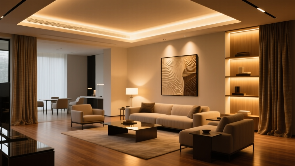
Room: 16’ x 20’, 9’-2” ceiling, north-facing with filtered daylight.
Artwork: Rothko (48” x 60”, framed, 6” off wall), plus two smaller pieces on same wall.
Fixtures: 4 × Halo H7ICATR, 98 CRI, 2700K, 900 lumens each.
Mounting: Two monopoints at 28” horizontal offset, two fixed trims at 18” offset—each aimed per 30° rule.
Control: Lutron