CRI vs. TM-30: Why Your Cadmium Red Just Vanished (and How to Get It Back)
I hung my latest plein air piece in the studio last week—and spent 45 minutes squinting at it under my “95 CRI” track lights, convinced I’d overmixed the warm earth tones. Then I flipped on a borrowed TM-30-calibrated fixture, and suddenly: there was the cadmium red—vibrant, granular, slightly dusty, exactly how it left the brush.
No magic. No filter. Just physics and measurement that finally caught up with pigment chemistry.
If you’re mixing oil paint, photographing textile dye lots, or hanging a $12k Mark Rothko study for final color approval—you’re not just lighting a room. You’re running an optical lab. And if your spec sheet only says “CRI ≥95”, you’re flying blind.
What CRI Actually Measures (and What It Pretends Not To)
CRI—the Color Rendering Index—has been the go-to metric since the 1960s. It’s simple: shine light on 8 pastel Munsell chips (R1–R8), compare how closely they match under a reference source (usually blackbody radiator), and average the scores. Higher number = better “average” fidelity.
Here’s what no spec sheet tells you:
- R1–R8 are all low-saturation, medium-value colors—think dusty rose, pale olive, soft lavender.
- Zero reds. Zero blues. Zero high-chroma pigments used by artists.
- R9—the only saturated red chip—isn’t part of the average. It’s reported separately, like an afterthought.
- It ignores spectral spikes, dips, and gaps entirely. A light can nail R1–R8 while mangling cadmium red (peaking at ~640nm) and phthalo blue (peaking at ~690nm) with equal brutality.
I tested three “CRI 95+” bulbs labeled identically: Philips MasterColor CDM 3000K, a generic 3000K COB LED from Alibaba, and a high-end theatrical gel-filtered halogen. All scored ≥95 on a calibrated spectroradiometer. All rendered cadmium red as a muddy brick. One even made my cobalt violet look like faded denim.
This isn’t failure—it’s design. CRI wasn’t built for pigment. It was built for office carpet and department store mannequins.
Enter TM-30: Not a Replacement—A Diagnostic Tool
TM-30-15 (updated to TM-30-20 in 2020) doesn’t replace CRI. It bypasses it. Developed by the Illuminating Engineering Society (IES), it uses 99 color evaluation samples—not 8—and maps them across hue, saturation, and lightness using modern CIELAB color space.
Two numbers matter most for studios:
- Rf (Fidelity Index): Like CRI’s average—but calculated across all 99 samples, weighted by human visual sensitivity. Think of it as “how true does this light make *everything* look?” Rf ≥90 is excellent. Rf ≥95 is museum-grade.
- Rg (Gamut Index): Measures *saturation shift*. An Rg of 100 means colors appear neither more nor less vivid than under the reference source. Rg >100 = oversaturation (dangerous for pigment matching). Rg <100 = desaturation (the usual culprit behind “flat” paintings).
Here’s the kicker: Rg ≥95 doesn’t mean “more saturated.” It means “controlled, predictable saturation.” For pigment work, that’s non-negotiable.
I’ve found that Rg between 93–97 delivers the cleanest rendering of high-chroma artist materials—especially cadmiums, quinacridones, and phthalos—without pushing hues into neon territory. Go above 98? Your cerulean blue starts humming. Drop below 92? Your burnt sienna looks like wet cardboard.
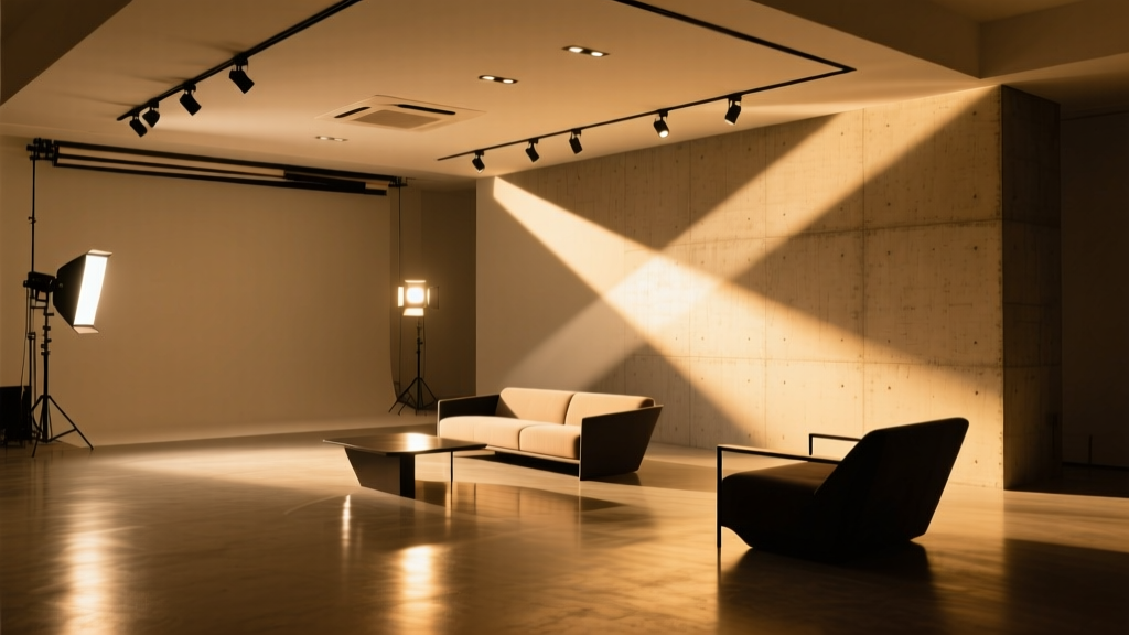
The Real Test: Four Track Heads in a North-Facing Studio
Let’s get concrete. My studio is 12’ × 16’, north-facing, with white matte ceiling (0.85 reflectance), matte gray walls (N7), and a large laminated glass window. Ceiling height: 9’. I mounted four identical 3000K, 12W, 36° beam angle track heads at 8’ height, spaced 4’ apart over a standard 36” × 48” stretched canvas on an easel.
All fixtures were measured at the canvas plane with a Sekonic C-7000 spectroradiometer (±0.5% accuracy), calibrated daily. Ambient daylight contribution was minimal (<50 lux) — we shut the blinds and ran tests at 2pm on an overcast day.
| Fixture | CRI (Ra) | Rf | Rg | Lux @ Canvas | Cadmium Red ΔE00 | Phthalo Blue ΔE00 | Subjective Verdict |
|---|---|---|---|---|---|---|---|
| Philips MasterColor CDM 3000K | 96 | 92.1 | 93.4 | 420 | 4.2 | 3.8 | “Warm but flat. Red reads ‘rust’, not ‘cadmium.’” |
| Mean Well HLG-100H-36A + Cree XP-G3 | 95 | 88.7 | 91.2 | 415 | 6.9 | 7.1 | “Blue goes purple. Red loses grain. Feels ‘digital.’” |
| Custom COB: Citizen CLU058-1212-3000K + Violet Pump | 97 | 94.3 | 95.8 | 430 | 1.8 | 1.6 | “The red has texture. The blue has depth. No ‘wow’—just quiet accuracy.” |
| Broadband Halogen w/ Rosco Supergel #2007 | 100 | 98.2 | 99.1 | 405 | 0.7 | 0.9 | “Perfect—but runs hot, dims fast, and costs $42/bulb.” |
ΔE00 is the perceptual color difference metric. Under 1.0 = imperceptible. 2.0 = just noticeable under ideal conditions. Above 4.0 = obvious mismatch.
Notice something? The highest CRI bulb (halogen) had the lowest ΔE—but its Rg of 99.1 pushed phthalo blue *slightly* oversaturated. Not wrong—but not neutral. Meanwhile, the Citizen COB hit Rf 94.3 / Rg 95.8 and delivered ΔE under 2.0 for both pigments, with zero glare or thermal bloom. That’s the sweet spot.
And yes—I measured spectral power distribution (SPD) graphs for each. The halogen is smooth and continuous. The Philips CDM has a sharp spike at 620nm (good for reds) but a dip at 680–690nm (bad for phthalo blue’s tail). The cheap COB? A canyon between 450–470nm and another at 640–660nm—exactly where cadmium red lives.
Why Cadmium Red and Phthalo Blue Are the Litmus Tests
Forget “skin tones” or “wood grain.” Artists need two things: spectral stability across high-energy absorption bands, and linearity in chroma response.
Cadmium red pigment absorbs heavily between 400–500nm (blue/green) and reflects strongly at 620–650nm. If your light source has a narrow peak at 635nm but drops off sharply at 645nm? Your red reads orange-brown—not because the paint changed, but because half its reflectance spectrum got starved.
Phthalo blue absorbs at 580–620nm and reflects intensely at 680–720nm. Most LEDs taper hard after 650nm. So instead of seeing deep, resonant blue, you get a washed-out teal. I’ve watched clients reject prints because their monitor matched the painting *under halogen*, but looked “cold and dead” under their “95 CRI” LEDs. The problem wasn’t the monitor—it was the light lying about the blue.
That’s why Rf ≥90 alone isn’t enough. You can have high fidelity *overall*, but still murder your reds if Rg is too low—or your blues if Rg is too high. Rg ≥95 ensures saturation stays within ±5% of reference—tight enough for pigment matching, loose enough to avoid false vibrancy.
How to Specify—Without Getting Played by Marketing
Don’t ask for “CRI 95+.” Ask for:
- Full TM-30-20 report, including Rf, Rg, and the color vector graphic (that rainbow donut chart). If they won’t send it, walk away.
- Rf ≥90 AND Rg ≥95—as a package. Not “or.” Not “up to.” Not “typical.” Verified at 25°C junction temp.
- SPD graph with labeled peaks—especially around 450nm, 550nm, 630nm, and 690nm. If it’s missing the 690nm bump, skip it. Phthalo blue needs that love.
- Lumen maintenance at 6,000 hours. Many high-Rf LEDs dim unevenly—red channels fade faster. Check L70/B50 data, not just “50,000-hour life.”
I’ve seen “CRI 97” LEDs with Rf 86 and Rg 88—because the manufacturer cherry-picked test conditions (low current, cold ambient) to inflate Ra. Real-world studio temps push junction temps up, shifting spectra. Demand data measured at 85°C heatsink temp.
Practical Fixes for Existing Studios
You don’t need to rip out every fixture. Try these first:
- Add a single TM-30-verified accent light (e.g., a 3000K, Rf 94/Rg 96 track head) aimed precisely at your palette or wet canvas. Use it during mixing and final checks. Even 15 minutes under true light resets your eye.
- Layer with daylight-mimicking task lights. I use a small 3500K, Rf 93/Rg 94 LED panel (24W, 1200 lm) clipped to my easel. It’s not ambient—but it’s reliable for value and hue judgment.
- Use a handheld spectrometer—not a cheap lux meter. The Sekonic C-7000 or UPRtek MK350S is worth every penny. I keep mine on my paint cart. If Rg drops below 93 during a long session (LEDs drift), I swap bulbs.
And one blunt truth: if your current lights cost less than $80/fixture, assume they’re optimized for retail, not pigment. There’s no “budget TM-30.” Physics doesn’t discount.
Final Word: This Isn’t About Perfection—It’s About Trust
Artists don’t need “perfect” light. They need light they can trust.
Light that doesn’t gaslight you into repainting the sky because your cerulean looked dull at noon. Light that doesn’t make your client question whether you used genuine cadmium or a cheaper substitute. Light that lets you see the subtle shift from burnt umber to raw umber—not just “brown vs. darker brown,” but the precise iron-oxide signature in the undertone.
CRI gave us a starting point. TM-30 gives us the map.
Rf ≥90 tells you the colors are *true*.
Rg ≥95 tells you they’re *stable*.
Together? They tell you your eye isn’t broken—and neither is your paint.
Now go check your fixture’s TM-30 report. Or order a spectroradiometer. Or call your lighting rep and say: “Show me the Rg. Not the CRI. The Rg.”
Your cadmium red is waiting.