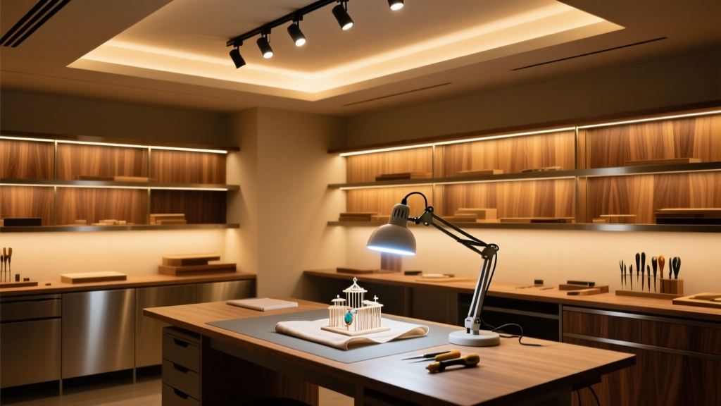
Craft Room Lighting: When “Good Enough” Makes You Squint at Your Own Work
You’re stitching a silk thread onto linen—and suddenly, the color you *know* is robin’s-egg blue reads as slate gray under your lamp. Or you’re blending acrylics on canvas and the pigment shifts mid-stroke. Or you’re gluing a 1:144 scale cockpit canopy, and the glue line vanishes until you squint, tilt your head, then blink three times. That’s not your eyes failing. It’s your light lying to you.Why 5000K Alone Is a Trap for Crafters
I’ve tested dozens of “craft lamps” labeled “daylight white.” Most sit at 5000K with CRI 92–94—and they *look* bright. But under them, cotton embroidery floss loses its subtle sheen. A #126 DMC thread (that soft seafoam green) reads duller, flatter, almost desaturated—not because the dye’s wrong, but because the lamp’s spectral output drops hard between 480–520nm, where cyan-green pigments live. And UV? Absent. So no fluorescence from archival papers, no pop from metallic threads, no way to spot dried glue residue on clear plastic model parts. 5000K isn’t the problem. It’s the *spectral gaps*. Without full, continuous output across violet through deep red—and crucially, controlled UV-A—your eye compensates. You lean in. You adjust monitor white balance. You second-guess your own choices.The Triad That Actually Works: CRI 98+, 4500K, + 365nm UV-A
What changed everything for me was pairing three non-negotiables:- CRI 98+ (R9 ≥ 96): Not just “high CRI”—this means saturated reds, deep cyans, and true pastels render without shift. Critical for matching thread to fabric, judging acrylic glaze transparency, or distinguishing walnut from cherry stain on balsa wood.
- 4500K correlated color temperature: Warmer than clinical 5000K, cooler than cozy 3500K. At 4500K, cotton thread retains its luminous, slightly creamy neutrality—no cool-blue cast that bleaches warmth out of natural fibers. It also keeps acrylics honest: cadmium yellow doesn’t read acidic, quinacridone rose doesn’t mute.
- Controlled 365nm UV-A (≤ 0.1 W/m² at 30 cm): Enough to excite optical brighteners in high-thread-count linens, reveal fluorescent dyes in modern embroidery floss, and make uncured cyanoacrylate glue glow faintly blue on plastic. Not enough to degrade silk, fade watercolor paper, or yellow epoxy over time. (Key detail: this isn’t blacklight party gear—it’s calibrated UV-A, filtered to block 320nm and below.)
Spectral Balance, By Material
Textiles (cotton, silk, wool): Need strong 400–450nm (violet/blue) + 600–650nm (orange-red) output. That’s where fiber dye absorption peaks—and where UV-A makes optical brighteners sing. Skimp here, and your cross-stitch looks muddy.
Acrylics & watercolors: Rely on clean 480–560nm (green-cyan) and 580–620nm (yellow-orange) fidelity. That’s how cerulean blue stays airy, not chalky—and why cadmium red doesn’t bleed into burnt sienna when wet-blended. CRI 98+ nails this; CRI 90 misses the subtlety.
Wood & plastic modeling: Demand contrast, not just color. UV-A reveals grain direction in basswood, highlights micro-scratches in polycarbonate canopies, and makes primer layers visible before sanding. 4500K gives warm-but-neutral rendering—so walnut stain reads rich, not orange; spruce reads pale, not washed-out.