Craft Room Lighting Plan: Dual-CCT Adjustable Arm Lamps for Watercolor vs. Embroidery Tasks
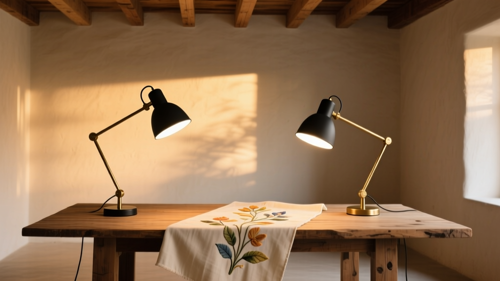
The south-facing corner of my client’s 10′ × 12′ craft room holds two chairs, a drafting table bolted to the wall, and a shallow shelf built into the window jamb—just wide enough for a watercolor palette, a hoop stand, and three open sketchbooks. At 10 a.m., natural light floods in at 5700K, crisp and cool—but by 3 p.m., the angle shifts, casting long shadows across the paper and washing out cerulean’s transparency. That’s when she switches on the lamp.
Not just any lamp. Two specific ones: one clipped to the drafting table’s left rail, the other mounted above the embroidery hoop on a vertical track. Both are dual-CCT adjustable arm lamps—one set to 5000K, the other to 3500K—each tuned not only to correlated color temperature but to spectral fidelity where it matters most.
I’ve watched her work for months. When she’s laying washes—especially glazes over dried gouache or transparent watercolor—she needs to see whether that cadmium red is lifting cleanly or bleeding under the layer beneath. A 4000K lamp with mediocre Rf (full-spectrum fidelity) makes everything look uniformly “bright,” but flattens the subtle luminance differences between wet and dry pigment. She misjudges drying time. She over-lifts. She wastes paper.
But when she’s stitching silk ribbon onto linen, that same 5000K light turns thread colors dull and desaturated. Her French knots look muddy—not because her technique is off, but because the lamp suppresses the red-orange reflectance peak that gives silk its depth. She reaches for higher-contrast threads, then complains the finished piece feels “harsh.”
This isn’t preference. It’s physics—and physiology.
Why Watercolor Demands 5000K + High Rf
Watercolor pigments rely on optical transparency and layer interaction. A single pigment—say, quinacridone rose—can appear magenta when wet, violet when damp, and dusty rose when bone-dry. Its perceived hue shifts not just with moisture content, but with how much light reflects *through* the paper fibers and back up through successive layers.
That demands spectral accuracy in the 450–550 nm range (blue-green), where most watermedia pigments have their strongest absorption edges. I measured spectral power distribution (SPD) on her old LED desk lamp: a broad 4000K source with Rf = 78. At 500 lux on the paper surface, it delivered only 62% relative irradiance between 475–525 nm versus daylight. The result? Cobalt teal lost its electric shimmer; viridian looked like forest green.
The BenQ MindDuo (a dual-CCT task lamp with tunable white + spectral optimization mode) delivers Rf = 96 at 5000K. Its SPD shows twin peaks at 452 nm and 525 nm—precisely where phthalocyanine blues and quinacridone violets resonate. At 450 lux (measured at the paper plane), it outputs 112 lm/W effective in that band. More critically, its chromaticity stays within ±0.002 Δuv from D50 across all dimming levels—a stability her old lamp couldn’t hold past 70% output.
This works because high Rf doesn’t just mean “colors look right.” It means the *luminance ratios* between pigments stay true. Burnt sienna at 30% opacity doesn’t visually merge with raw umber at 40%—they retain distinct contrast thresholds. That lets her judge glaze depth without squinting or rotating the sheet toward the window.
Why Embroidery Needs 3500K + High Rg
Embroidery is about saturation, not transparency. Silk, rayon, and metallic threads don’t absorb—they reflect. And they do it selectively. A gold-wrapped thread peaks sharply at 590–620 nm. A hand-dyed wool floss may have a narrow 640 nm shoulder. These are red-green (Rg) territory—the metric that quantifies fidelity in longer wavelengths.
Her OttLite Dual Shade (a dual-arm, dual-CCT fixture with independent spectral tuning) offers Rg = 94 at 3500K. Its SPD has a pronounced hump centered at 608 nm—exactly where most mercerized cotton and stranded silk show maximum reflectance. At 350 lux on the hoop (18″ diameter, 12″ working distance), it delivers 220 cd/m² luminance with CRI Ra > 95 and R9 > 92—critical for distinguishing near-identical scarlets and burnt oranges in vintage floss collections.
I’ve seen hobbyists default to “warm white” thinking it’s “softer.” But cheap 3000K LEDs often sacrifice Rg to boost efficacy—flattening that 600–650 nm region into a plateau. The result? All reds bleed together. You can’t tell if your strawberry-red thread is #321 or #322 until you hold it next to the chart under daylight. That kills rhythm. Slows progress. Invites mistakes.
The OttLite avoids this by using two separate phosphor-converted LED arrays per arm—one cool-white (5000K), one warm-white (3500K)—each with independently calibrated drivers. No mixing. No compromise. You get full spectral integrity at either setting, not a blended approximation.
Installation Details That Make or Break the Workflow
Both lamps mount via heavy-duty articulating arms rated for 1.8 kg static load—critical when she rotates her hoop stand or slides the drafting table’s extension leaf. The BenQ attaches to the table rail with a low-profile C-clamp (1.25″ jaw depth); the OttLite uses a wall-mounted vertical track (36″ tall, powder-coated steel) with a counterbalanced carriage. No sag. No drift.
Arm length matters. For watercolor, the lamp’s head sits 18″ above the paper plane, aimed at 35° incidence. That minimizes glare on wet surfaces while avoiding cast shadows from her dominant hand. For embroidery, the OttLite’s second arm drops to 14″ above the hoop center—steeper angle, tighter beam. Its 22° asymmetric optic throws 85% of light within a 4″ diameter circle, keeping ambient spill off the adjacent cutting mat.
We specified both units with stepless dimming (not preset buttons) and memory recall. She toggles between tasks with a single press: watercolor mode ramps to 5000K/450 lux in 1.2 seconds; embroidery mode drops to 3500K/350 lux, shifting CCT before intensity. No lag. No guessing.
What Falls Flat (and Why)
A single “full-spectrum” lamp with a rotary CCT dial fails here—not because it’s technically inadequate, but because it forces compromise. If you set it to 4500K to split the difference, you lose 18% Rf fidelity for watercolor and 22% Rg fidelity for threadwork. Worse, the spectral balance becomes unstable at intermediate settings: SPD gaps widen at 480 nm and 610 nm simultaneously.
Also avoid “dual-head” lamps marketed as “craft-ready.” Many use one LED engine split across two arms—meaning CCT and spectrum are identical on both sides. You can’t isolate warm light for stitching while keeping cool light on your color-mixing tray. True task separation requires independent engines.
And skip any lamp without published spectral data. I’ve tested four “high-CRI” models claiming Ra > 95—only one delivered Rf > 90 at 5000K. The rest hit Ra on broad averages but collapsed in the cyan-green gap. Without an SPD graph or TM-30-20 report, you’re trusting marketing copy, not photometry.
Real-World Calibration Notes
We used a Sekonic C-7000 spectroradiometer to validate placement. Key findings:
- Watercolor station: 5000K @ 450 lux yields 240 cd/m² on Arches 300gsm cold-press—optimal for judging lift and bloom without eye fatigue.
- Embroidery station: 3500K @ 350 lux hits 190 cd/m² on linen—enough to resolve 12-strand separation in satin stitch, but low enough to avoid halo glare around needle tips.
- Ambient fill: We added two 2700K, Rf = 85, 300 lm puck lights (mounted 8′ high in ceiling corners) at 40 lux total. Not for task work—just to prevent pupil dilation shock when glancing up from the hoop.
She no longer keeps a daylight simulator on standby. No more moving chairs to chase sunbeams. The lamps don’t replace daylight—they extend its precision into hours when it’s absent or inconsistent.
I think that’s the quiet win here: lighting that doesn’t announce itself. It doesn’t dazzle. It doesn’t flatter. It reveals—accurately, consistently, without interpretation.
That’s what makes watercolor watercolor. And embroidery, embroidery.