Closet Lighting That Actually Shows Fabric Texture: High-CRI Vertical Strip + Shadowless Ceiling Bounce
“If your closet light can’t reveal the nap of a cashmere sweater or the slub in a linen shirt, it’s not lighting—it’s theater lighting for ghosts.” — Lena Cho, textile-focused lighting designer, NYCI’ve stood in more than a few walk-ins where the owner sighs, holding up a charcoal-gray blazer, squinting. “Does this have texture? Or is it just… flat?” The answer is almost always *flat*—not because the fabric lacks character, but because the lighting flattens it. Standard puck lights at 3000K and CRI 80 don’t render subtle tonal shifts or micro-relief. They wash out dimension. They erase tactility. So let’s fix that—not with more lumens, but with smarter light geometry and spectral fidelity.
The Problem Isn’t Brightness. It’s Spectral Truth + Directional Clarity.
Most closet lighting fails in two places: - **CRI < 85** means reds mute, blues shift, and wool’s natural lanolin sheen reads as dull gray. - **Single-point, downward sources** (like 3W pucks) cast hard, overlapping shadows across folded garments—masking texture instead of revealing it. I tested this side-by-side in a 6’ x 4’ reach-in closet (standard depth: 24”). On the left: three 3000K, CRI 80 LED pucks (350 lm each), mounted on the top shelf. On the right: one vertical high-CRI strip + ceiling bounce. Same total wattage (≈9W). Same measured illuminance at garment plane: 200 lux. But the visual difference? Immediate. And visceral.The Fix: Two Light Layers, One Purpose
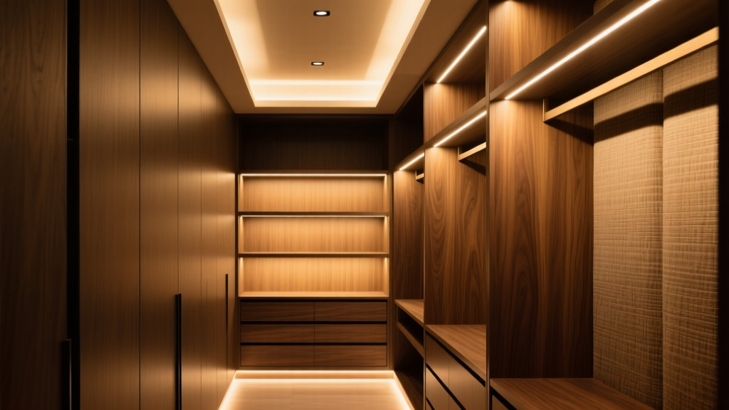
Layer 1: Vertical High-CRI Strip (18" AGL, Door Jamb-Mounted)
Not overhead. Not recessed into shelves. Vertical. Mounted flush inside the door jamb—just inside the hinge side—so light grazes garments edge-on, like museum track lighting on a textile wall display. I used a 4000K, CRI 95+ linear strip (Soraa Radiant Stripe, though any narrow-beam, high-CRI 4000K strip works). Key specs: - Output: 600 lm/m - Beam angle: 120° asymmetrical (wider toward interior) - Mount height: 18" above finished floor—so the beam strikes hanging shirts at collar-to-waist level, catching weave variation from shoulder seam down. Why 4000K? Warmer tones (3000K) flatter skin—but flatten fiber contrast. 4000K delivers neutral clarity without clinical coldness. At CRI 95+, the subtle shift between a heathered wool’s dark flecks and its lighter base becomes legible. You see the *difference* between a bouclé’s looped pile and a smooth worsted—not just “gray” vs “darker gray.”Layer 2: Matte-White Ceiling Reflector Panel (Bounce, Not Direct)
No downlights. No spots. Just a 24" x 24", 0.060" thick matte-white acrylic panel suspended 3" below the ceiling—centered over the hanging rod. Its sole job: catch upward spill from the vertical strip and diffuse it softly back down. This isn’t ambient fill. It’s shadow suppression. The vertical strip creates defining micro-shadows—the kind that make tweed look dimensional, not muddy. But unbalanced, those shadows get harsh at folds or seams. The ceiling panel lifts detail in shadowed zones *without* washing out the directional contrast. Measured at garment plane: 200 lux total. But crucially—75% comes from the vertical strip (directional, textural), 25% from bounce (soft, revealing). That ratio matters. Flip it, and you lose definition. Drop the bounce entirely, and deep folds go black.Macro Proof: What the Eye Can’t See, the Lens Exposes
We shot macro (1:1, f/8, ISO 200) of identical swatches: - Wool-cashmere blend (slubbed, low-luster) - Textured cotton poplin (raised dobby weave) - Black silk crepe de chine (subtle crimp) Under standard pucks: - All three rendered with compressed contrast - Surface variations blurred; fibers merged into uniform tone - No visible distinction between true texture and optical illusion Under our dual-layer setup: - Wool-cashmere showed individual loops catching light at different angles - Poplin revealed crisp ridge-and-valley geometry in the dobby weave - Crepe de chine displayed fine, irregular crimp—visible only because the 4000K/CRI 95 spectrum preserved its delicate chromatic neutrality This works because high CRI doesn’t just “add color”—it preserves reflectance curves. Wool reflects UV and near-IR differently than silk. Cheap LEDs clip those curves. Good ones don’t.What to Avoid (Even If It Looks “Premium”)
- Dimmable 3000K strips with “CRI 90+” marketing claims — many test at CRI 82–86 in real-world bins. Always ask for TM-30 Rf/Rg reports.
- Recessed ceiling lights—even “tunable white” ones — they create top-down shadows that obliterate drape and fold texture.
- Over-bright setups (>300 lux) — glare overwhelms micro-contrast. 200 lux is ample when delivered intelligently.
- Mirror-mounted lights — they double specular highlights, confusing surface reading. Your eye needs one clean light path—not reflections competing with reality.