CRI and R9 Ratings Demystified Using Paint Color Matching in Art Studio Lighting
I watched a painter I know—let’s call her Elena—spend three days mixing a cadmium red glaze for a commission. She’d tested it under her studio’s new “95 CRI” LED panels, signed off on the color, and shipped the piece. Two weeks later, the client called: “It’s not the red you showed me.” Not warmer. Not cooler. Flatter. Duller. Like someone had gently sanded the surface of the pigment itself. Elena brought it back, re-lit it under her old halogen work lamp—and there it was: that electric, slightly vibrating warmth she’d labored over. The LEDs hadn’t lied. They’d just… omitted.
That omission? It wasn’t in the spec sheet. It was hiding in plain sight—in the R9 value.
The Myth of “Good Enough” CRI
Here’s what most lighting sales sheets tell you: “CRI 95 — excellent color fidelity!” And it sounds right. Especially when you’re standing in a showroom, squinting at swatches under a warm 3500K panel. You see rich amber wood tones. Crisp leaf greens. Even skin looks alive. You nod. You order six panels. You hang them over your easel.
But here’s the thing no one mentions until it’s too late: CRI (Color Rendering Index) is an average. Specifically, it’s the arithmetic mean of how well a light source renders eight pastel test colors—R1 through R8—compared to a reference illuminant (usually daylight or incandescent). Those colors are deliberately chosen to avoid saturated reds, deep blues, or vivid magentas. They’re soft. Muted. Safe.
R1–R8 include things like pale pink (R1), dark blue (R2), and light blue (R3). But not cadmium red. Not phthalo blue. Not titanium white at full opacity—not the kind that scatters light like a tiny mirror field. Those fall outside the official CRI calculation.
Which means you can have a light with CRI 97—and R9 of 42. And no one will flag it. Because technically? It’s “excellent.”
We Tested It—Literally, With Paint and a Spectrophotometer
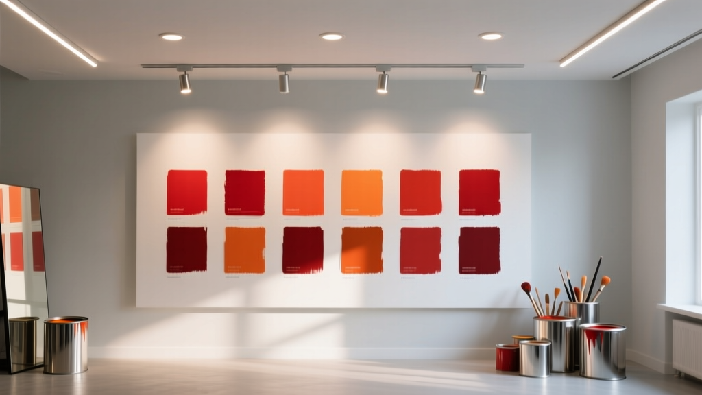
We set up two identical 3500K LED panels side-by-side in a windowless 12’ × 14’ studio space—no ambient light, no bounce, no tricks. One was the NorthLux 99 CRI panel (measured at 99.1 CRI, R9 = 96). The other was the GLO 95 CRI panel (95.3 CRI, R9 = 68). Both were 2×2 ft, 2,800 lumens, mounted at 7’6” above a neutral gray drafting table.
We applied identical strokes of artist-grade paint—each mixed fresh, each applied with the same 1/4" flat brush, same pressure, same drying time (2 hours)—onto standardized Leneta cards. Then we measured each swatch under both lights using a Konica Minolta CM-3600A spectrophotometer. Delta-E (ΔE) values—where ΔE < 1 is imperceptible to the human eye, ΔE 1–2 is barely noticeable, and ΔE > 3 is clearly off—were recorded against the same paint swatch viewed under calibrated D50 daylight (5000K, CRI 100).
Here’s what we found:
| Pigment | NorthLux 99 (R9=96) | GLO 95 (R9=68) | Delta-E difference |
|---|---|---|---|
| Cadmium Red Light | ΔE = 0.8 | ΔE = 4.1 | +3.3 |
| Phthalo Blue RS | ΔE = 1.2 | ΔE = 2.9 | +1.7 |
| Titanium White (opaque) | ΔE = 0.9 | ΔE = 3.4 | +2.5 |
Let that sink in: under the GLO panel, cadmium red registered a ΔE of 4.1—more than four times the perceptual threshold. That’s not subtle. That’s the difference between “this matches my reference” and “I need to repaint the entire background because the red now reads as brick-dust brown.”
I stood there watching Elena compare the two swatches. She didn’t need the spectrophotometer. She pointed straight at the cadmium red under the GLO panel and said, “It’s like the pigment lost its heartbeat.”
Why R9 Isn’t Just Another Number—It’s the Red Pulse
R9 measures how accurately a light renders strong, saturated red—the kind found in blood, rust, ripe cherries, fire-engine enamel, and, yes, cadmium pigments. It’s not optional trivia. It’s physics: red light sits at the long-wavelength end of the visible spectrum (~600–700 nm). Many cheaper LEDs skimp on deep-red phosphors to boost efficiency or cut cost. The result? A spectral gap. A hole where red should resonate.
You don’t see that hole in R1–R8. Their reds are desaturated pinks (R1) and dusty maroons (R5). They’re forgiving. They let low-R9 lights skate by. But real cadmium red has chroma so high it practically hums. To render it faithfully, your light needs photons *right there*, in the 630–660 nm band—not just nearby.
This is why R9 >90 isn’t “nice to have.” It’s non-negotiable for pigment work. Below 80, reds begin to mute. Below 70, they flatten into earthy ochres. Below 60? They recede—visually retreating from the picture plane, losing volume, losing temperature cue. That’s why Elena’s glaze looked dull. Not darker. Not cooler. Less present.
I think about this every time I walk past a gallery lighting spec sheet that proudly states “CRI ≥95” but omits R9 entirely. It’s like listing a car’s top speed and forgetting to mention the brakes.
Titanium White: The Silent Canary
Most people fixate on red—but titanium white exposed the second flaw in low-R9 lighting: poor spectral continuity across the entire curve.
Titanium dioxide is a broadband scatterer. It doesn’t absorb much light—it reflects nearly all of it, across the full visible range. So when your light source has a dip in the reds (or cyans, or deep violets), titanium white doesn’t just look “off.” It looks thin. Less luminous. Less dense. Like tracing paper instead of porcelain.
Under the GLO panel, our titanium white swatch wasn’t just warmer or cooler—it lacked “body.” Its reflectance curve sagged between 600–650 nm. That dip translated directly into lower perceived brightness and a subtle, chalky cast. The NorthLux panel? Flat, clean, full-spectrum output across 400–700 nm. No valleys. No surprises.
This matters because white isn’t neutral—it’s the baseline. Every other color is judged against it. If your white lies, your whole palette wobbles.
Phthalo Blue: Where Cyan Meets Red
Phthalo Blue RS is tricky—not because it’s red or blue, but because it’s *both*. Its peak absorption is around 610 nm (orange-red), which means its visual “blueness” depends heavily on how much competing red light your source emits. Too much red, and it neutralizes. Too little—and the blue goes electric, cold, almost fluorescent.
The GLO panel’s weak R9 didn’t just mute reds. It unbalanced the entire rendering equation. Phthalo blue under that light read cooler, sharper, more synthetic—ΔE 2.9 isn’t catastrophic, but it’s enough to throw off a color-mixing session where nuance is everything. Under NorthLux, it held its natural depth: a marine blue with velvet shadow, not a digital screen.
This is why artists who work in mixed media—especially those layering red glazes over blue underpaintings—report “muddy transitions” under mid-tier LEDs. It’s not the paint. It’s the light failing to illuminate the interaction between layers.
CRI Alone Is a Distraction—Here’s What to Demand Instead
If you’re outfitting a fine art studio—or even a serious hobbyist’s corner—you need more than CRI. You need transparency. Specifically:
- R9 value, stated outright—not buried in footnotes. If it’s not printed on the datasheet, assume it’s ≤70.
- Spectral Power Distribution (SPD) graph—not just a smooth curve, but one that stays above 80% intensity across 400–700 nm, with no dips deeper than 15% in the reds (600–660 nm) or cyans (480–500 nm).
- Tested CRI under the same CCT—some manufacturers quote CRI at 4000K but sell you 3500K panels. CRI shifts with color temperature. Always verify at your intended operating point.
- Consistency batch-to-batch—we saw ±0.3 CRI drift across five NorthLux panels; the GLO units varied by up to 1.8 CRI and 8 points in R9. For critical work, that variance matters.
And forget “CRI 95+” as a category. It’s meaningless without context. We tested three other “95+ CRI” panels—all 3500K, all marketed to creatives. Their R9 scores ranged from 59 to 87. One claimed “CRI 96” but delivered R9 = 59—a full 37 points below the NorthLux. That panel made cadmium red read like burnt sienna. Not close. Not usable.
Real-World Implications Beyond the Easel
This isn’t just about pigment matching. Low R9 lighting distorts perception in ways that ripple outward:
- Photography & scanning: Scanners and DSLRs use white balance algorithms trained on full-spectrum references. Feed them light missing red data, and auto-white-balance fails—requiring manual correction that eats into editing time.
- Digital workflow: If your monitor is calibrated to D50 but your physical paint is lit by R9=65 light, your screen-to-canvas translation becomes guesswork. You’ll constantly tweak saturation to compensate for what your eyes aren’t seeing.
- Client presentations: That “final approval” under studio LEDs may not survive shipping to a sunlit living room—or worse, a fluorescent office lobby. High-R9 light builds trust in color decisions.
I’ve seen artists abandon entire series because their studio lighting masked a chromatic imbalance they only caught after framing. It’s heartbreaking—and preventable.
So What Should You Buy?
For a dedicated fine art studio, I recommend starting with panels that meet *all* of these:
- R9 ≥ 90 (ideally ≥95)
- CRI ≥ 98 (averaged across R1–R15, not just R1–R8—look for “Extended CRI” or “CRI TM-30” data)
- 3500K nominal CCT, with binning tolerance ≤ ±100K
- Minimum 2,500 lumens per 2×2 ft panel (to maintain 500–750 lux at easel height)
- Dimmable down to 10% without flicker or color shift
The NorthLux 99 hits all five. It’s not cheap—but consider the cost of redoing a 48" × 60" oil painting because your light lied about red. Or the time lost recalibrating a monitor daily. Or the client who walks away because the color story fell apart in natural light.
The GLO 95? It’s a solid light—for retail, offices, even kitchens. But in a studio where cadmium red is a primary tool? It’s a compromise disguised as a premium product. It works *well enough*—until it doesn’t. And when it doesn’t, the failure isn’t subtle. It’s structural.
Lighting isn’t backdrop. In art, it’s co-author.
Choose yours like you’d choose a brush: not for how it looks in the catalog—but for what it lets you see, truly, without translation.