Track lighting doesn’t have to look like a fluorescent strip glued to your ceiling.
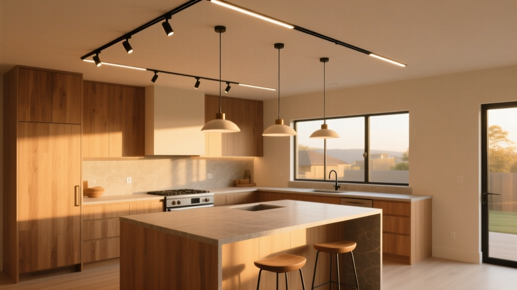
Let’s be blunt: the “light strip” effect—the long, unbroken, evenly spaced line of identical track heads running parallel to an island or along a galley wall—is the single biggest reason homeowners abandon track systems before installation day. They imagine sleek modernity; they get warehouse logistics. I’ve seen it happen three times this month alone—clients scrolling past Pinterest pins of warm, sculptural kitchens, then pausing on a photo captioned *“Track lighting done right”*, squinting at the ceiling, and muttering, *“Wait—that’s just… lights in a row.”* That’s not a failure of track lighting. It’s a failure of intention. The popular take? *“Track is modular, so just add more heads where you need light.”* The reality? Modularity without hierarchy creates visual static—not flexibility. You wouldn’t hang five identical framed prints in a straight line across a living room wall and call it curation. So why do it with light? Here’s how to break the line—and why it works.Asymmetry isn’t decorative. It’s directional storytelling.
Symmetrical track layouts obey architectural lines: center island, align with cabinets, mirror the range hood. That’s safe. It’s also why your kitchen feels like a showroom floor. I swapped symmetry for asymmetry in a 10’×12’ galley kitchen last spring—and the difference wasn’t subtle. Instead of six identical 30° heads spaced 24” apart above the island, we used four heads: two narrow-beam (15°) aimed precisely at the sink bowl and stovetop zone, one medium (30°) washing the open shelf display, and one wide (45°) grazing the backsplash tile. All mounted on a single 8’ track—but staggered: 18”, then 36”, then 12”, then 30”. No rhythm. No repetition. Just purpose. This works because human eyes don’t scan linearly in kitchens—they dart: from recipe screen → cutting board → coffee maker → pantry door. Asymmetric placement mirrors that behavior. Your light follows attention—not architecture.Beam spread isn’t about brightness. It’s about scale calibration.
A 15° beam on a 9’ ceiling delivers ~18” of focused light at counter height. Perfect for illuminating a knife block or spice rack—no spill, no glare. A 45° beam at the same height throws ~60” of soft, even wash—ideal for breakfast nook seating or a shallow pantry wall. Most kitchens default to 25°–30° across the board. That’s like using only medium-sized paintbrushes: technically functional, visually flat. In our 14’×20’ open-plan layout (island + dining + lounge adjacency), we allocated beam spreads by task *and* by surface depth:- Sink zone (10’ run): Two 15° heads (350 lumens each, 5W LED) — precise, shadow-free task light over stainless steel
- Island perimeter (12’ run): Three 30° heads (650 lm, 7W) — balanced spill for casual prep and conversation
- Backsplash wall (8’ tall, full height): One 45° head (900 lm, 10W), mounted low on track and tilted 15° downward — creates vertical emphasis, warms the tile without washing out art above
- Dining extension (beyond island): One 45° head (1100 lm, 12W) aimed at tabletop — avoids the “halo” effect of pendant-only zones
Staggered spacing isn’t random. It’s rhythmic breathing.
Linear spacing forces the eye to march. Staggered spacing lets it pause. Think of it like music: even eighth notes feel mechanical until you insert a rest, a syncopation, a held note. Light works the same way. In the 10’×12’ galley, we placed heads at these distances from the track’s starting point:- 18” — 15° head over primary prep zone
- 54” — 30° head over secondary counter (near fridge)
- 66” — 45° head angled toward open shelving
- 96” — 15° head over sink
Layout templates: practical, not prescriptive
These aren’t blueprints. They’re starting points—tested in real homes, adjusted for real ceilings and real habits.Template A: 10’×12’ Galley Kitchen (8’ ceiling, standard depth counters)
Single 8’ track runs parallel to island, 30” from front edge. Mounting height: 84” AFF.
| Fixture Position (from track start) | Beam Spread | Lumens / Wattage | Target Zone | Why This Spot? |
|---|---|---|---|---|
| 18” | 15° | 350 lm / 5W | Primary prep area (cutting board zone) | First point of contact after entering—needs precision, zero glare |
| 54” | 30° | 650 lm / 7W | Secondary counter (near fridge/freezer) | Broad enough for grabbing snacks or unloading; spaced to avoid overlap with prep zone |
| 66” | 45° | 900 lm / 10W | Open shelving unit (36” wide × 12” deep) | Wide beam wraps the depth of shelves; tilt ensures light hits front and back edges evenly |
| 96” | 15° | 350 lm / 5W | Sink bowl (centered) | Narrow beam prevents splashback glare; positioned at end of track to avoid visual “crowding” |
Total wattage: 27W
Key detail: The 12” gap between positions #2 and #3 (54”→66”) creates a deliberate “quiet zone”—letting ambient light from nearby windows or under-cabinet strips fill in gently.
Template B: 14’×20’ Open-Plan Kitchen (9’ ceiling, island + dining flow)
Two 10’ tracks: one 30” from island front edge (primary task track), second 12” from dining table’s long edge (ambient/dining track). Tracks offset by 6” vertically—no alignment, no mimicry.
| Track & Position | Beam Spread | Lumens / Wattage | Target Zone | Mounting Tip |
|---|---|---|---|---|
| Task track @ 18” | 15° | 350 lm / 5W | Stovetop (left burners) | Tilt 5° downward—prevents glare on cook’s face |
| Task track @ 60” | 30° | 650 lm / 7W | Island countertop (seating side) | Mounted on swivel joint—adjustable for bar stool vs. standing use |
| Task track @ 96” | 15° | 350 lm / 5W | Sink (centered) | Same as Template A—non-negotiable for clarity |
| Dining track @ 24” | 45° | 1100 lm / 12W | Dining table surface (60” round) | Positioned so beam edge lands just beyond table edge—no spill onto adjacent lounge rug |
| Dining track @ 72” | 45° | 900 lm / 10W | Buffet/console behind table | Lower lumen count balances output—avoids competing with table light |
Total wattage: 49W
Key detail: The 36” gap between dining track heads (24”→72”) isn’t empty—it’s reserved for a dimmable, warm-white (2700K) linear under-cabinet strip along the buffet’s underside. That layer adds depth without adding fixtures.