“Lighting isn’t about illumination — it’s about framing the moment you lean in to share food, conversation, or quiet. Get the height wrong, and you’re not just casting shadows — you’re interrupting the ritual.”
— Elena Ruiz, lighting designer for Field & Hearth Studio, whose farmhouse-kitchen projects span Vermont barn conversions to Austin bungalows.
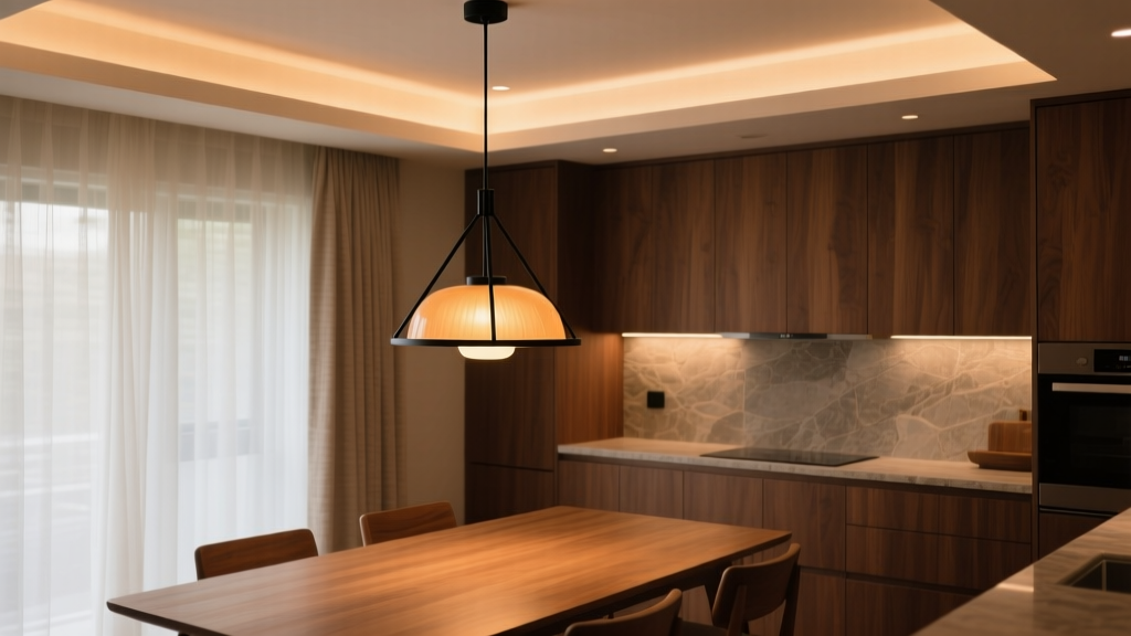
I’ve stood under too many pendants that felt like low-hanging fruit: too close, too hot, too distracting. Or worse — so high they vanished into the ceiling, leaving a kitchen island lit like a parking lot at midnight. It’s not just aesthetics. It’s ergonomics. It’s intimacy. And yes — it’s math, but the kind you can measure with a tape measure and a stool, not a calculator.
This guide is written for people who care whether their 24" wide oak island feels warm and anchored — or lost under a pair of oversized brass pendants dangling like confused satellites. We’ll walk through real numbers, real rooms (9-ft and 11-ft ceilings), and why the “kitchen island vs. dining table” rule isn’t arbitrary — it’s rooted in how we use space, how our eyes move, and how light interacts with human scale.
Where the Rule Came From (and Why It Stuck)
Back in the ’50s, mid-century designers didn’t publish pendant height charts — they watched people eat. They noticed something simple: when seated at a dining table, your line of sight naturally rises 2–3 inches above the tabletop. A pendant hung 28–32" above that surface lands its bottom rim between your chin and collarbone — close enough to define the table, far enough to avoid glare or head-bumping.
Kitchen islands changed the game. You’re often standing — or perched on a 30" bar stool — and leaning *over* the surface to chop, pour, or scroll. That changes your eye level by nearly 10". Now your gaze hits the countertop at a 30–45° downward angle. So the fixture needs to hang lower — 30–36" — to stay within the “sweet zone”: where light pools *on* the surface without spilling into your eyes.
I think this distinction matters because so many renovators treat both spaces the same. They install identical pendants over island and table — same height, same spacing — and wonder why the dining area feels cozy while the island feels clinical. It’s not the bulb. It’s the geometry.
The Core Formula (No Algebra Required)
Forget complicated equations. Here’s what actually works on site:
- Kitchen island: Bottom of fixture = 30" to 36" above countertop surface
- Dining table: Bottom of fixture = 28" to 32" above tabletop surface
That’s it. But — and this is critical — those numbers assume standard ceiling heights (8–9 ft) and average fixture diameters (12–18"). Go taller, wider, or dimmer, and the math shifts.
Ceiling Height: The Silent Variable
A 9-ft ceiling is the baseline most guidelines assume. An 11-ft ceiling? That extra 24 inches doesn’t just give you breathing room — it changes how light behaves in the volume of the room.
I’ve seen clients install a single 16" wide black metal pendant over a 72" island in an 11-ft kitchen, hanging it at 32". Result? It looked like a forgotten coat hook. Too small. Too high. The light pool barely reached the edges of the countertop.
Here’s what we do instead:
| Ceiling Height | Recommended Pendant Diameter (per fixture) | Min/Max Height Above Surface | Why It Works |
|---|---|---|---|
| 9 ft (108") | 12–16" | 30–34" | Proportional balance: fixture occupies ~12–15% of vertical space from surface to ceiling. Light spreads evenly across standard 24–30" deep countertops. |
| 11 ft (132") | 16–22" | 32–36" | Needs visual weight to avoid floating. Higher hang keeps light focused on task zone without requiring excessive wattage. Larger diameter compensates for increased distance to surface. |
Note: These are for *single-pendant* setups over narrow islands (<48") or round tables. Most kitchens and dining areas use multiples — and that’s where spacing becomes as important as height.
Spacing & Multiples: Why Three > Two (Mostly)
Two pendants over a 72" island? Feels like bookends — functional, but visually thin. Three? Lets you tune the rhythm: center one over the middle, flanking ones spaced 30–36" apart (measured from center to center), each still landing 32–34" above the counter.
Real example: A client in Asheville remodeled a 1940s farmhouse with a 9-ft ceiling and a 96" L-shaped island (30" deep). We used three 14" matte black drum pendants, 32" above surface, spaced 32" on-center. Total coverage: 96". Light output? 800 lumens each (2700K, dimmable). No dark spots. No glare. Just warm, even task light — and the fixtures themselves read as intentional punctuation, not afterthoughts.
For dining tables, go with odd numbers whenever possible — especially for rectangular tables. Three over a 72" table; five over a 96" table. Why? Symmetry reads as stable and grounded. Even numbers risk feeling like a hallway or a conference room.
And here’s a pro tip I learned the hard way: if your table extends beyond 84", skip the center pendant entirely. Hang two or three *above the ends*, angled slightly inward. One client with a 108" refectory table tried a centered trio — looked like a traffic light over dinner. Switched to two 18" brass globes, 30" above surface, spaced 42" apart (center-to-center), and the whole space softened instantly.
Fixture Diameter Matters More Than You Think
A 10" pendant hung at 32" over a 30" deep island throws a light pool ~24" wide — fine for a coffee station, useless for meal prep. But bump that to 18", and the pool widens to ~40", comfortably covering sink, cutting board, and stove edge.
We use this quick check on site:
- Measure island depth (front to back).
- Divide by 2 — that’s your ideal minimum fixture diameter.
Example: 30" deep island → min 15" pendant - Add 2–4" for ceilings >9 ft or for layered lighting (e.g., pendants + recessed).
Same logic applies to tables — but with a twist. Dining tables are usually narrower (36–42" deep), so 12–16" pendants dominate. But go too wide — say, an 18" globe over a 36" round table — and the fixture crowds the space, blocking sightlines and making chairs feel cramped.
I’ve found that 14" is the sweet spot for most farmhouse and mid-century dining: large enough to feel substantial, small enough to recede when not in focus. Pair it with a linen shade or amber glass, and it glows like candlelight — no harsh edges.
Real Rooms, Real Measurements
Case Study 1: The 9-ft Ceiling Farmhouse Kitchen (Portland, OR)
- Ceiling height: 9 ft 0 in (108")
- Island: 72" × 30", quartz countertop, open to dining nook
- Pendants: Three 14" matte white ceramic domes, 32" above surface, 34" on-center spacing
- Result: Light pool measures 38" wide at countertop level. No hotspots. Bulbs: 9W LED (800 lm, 2700K). When dimmed to 50%, it’s perfect for late-night snacks — soft, directional, zero glare.
What made it work wasn’t just the height — it was the consistency. All three pendants hung from adjustable stems (no rods cut on-site), and we used a laser level to ensure absolute uniformity. One inch of variance between fixtures creates visual vibration — subtle, but fatiguing over time.
Case Study 2: The 11-ft Ceiling Mid-Century Dining Room (Chicago, IL)
- Ceiling height: 11 ft 2 in (134") — original plaster crown, 10" tall
- Table: 96" × 42", walnut slab, Eames-style chairs
- Pendants: Three 16" spun-brass conicals, 30" above tabletop, 40" on-center spacing
- Result: Fixtures sit just below eye level when seated — creating gentle uplight on faces and downlight on plates. Light spread is even across full table length. Lumens: 1,100 each (3000K, high-CRI).
Key detail: we dropped the pendants *before* installing the table — then adjusted final height with chairs in place. Because here’s the truth: if your chairs have 18" seats (most mid-century do), and your tabletop is 29", your seated eye level is ~42" above floor. So 30" above tabletop = ~72" above floor — right in that chin-to-shoulder band Elena mentioned.
When to Break the Rules (Responsibly)
Rules exist to be tested — but only when you understand why they’re there.
Exception 1: Very tall users or bar-height islands. If your island is 42" high (true bar height) and you’re 6'4", 36" above surface may still cause glare. Drop to 28" — but only if your fixture is narrow (<12") and shielded (e.g., downward-focused LED with frosted glass). I did this for a basketball coach in Denver — 12" black cylinder, 28" above a 42" island. Worked because the beam angle was tight (24°), and the shade blocked all upward spill.
Exception 2: Low ceilings with exposed ductwork. A client in a converted loft had 7'8" clear ceiling height over her island. We went with ultra-low-profile 8" disc pendants at 26" — but mounted them *into* the duct cover, not suspended below it. It broke the “30+” rule, but preserved headroom and kept light where it mattered.
Never break the rule for style alone. I saw a gorgeous 20" rattan pendant hung at 24" over a 36" table — stunning photo, terrible experience. Guests ducked. Light washed walls instead of plates. It looked like a prop, not a fixture.
Your Action Plan (Before You Buy or Hang)
- Measure twice, order once. Get exact ceiling height (floor to finished ceiling), surface height (floor to countertop/tabletop), and user eye level (floor to chin, seated and standing).
- Sketch it. Draw a vertical section: mark ceiling, surface, eye level, and proposed pendant bottom. Does the fixture live between eye level and surface? Does it avoid the “glare zone” (roughly 40–55" above floor when seated)?
- Test the spread. Use painter’s tape on the ceiling to mark pendant centers. Hang strings with weights to simulate height. Walk around. Sit. Stand. Does it feel like it belongs — or like it’s waiting for permission?
- Choose bulbs last — but choose deliberately. A 14" pendant with a 1000-lumen warm white LED feels generous. Same fixture with a 400-lumen vintage filament bulb feels cozy, but insufficient for prep. Match lumen output to function: 700–900 lm for dining ambiance; 900–1200 lm for island tasks.
One final note: don’t overlook cord length and canopy style. In farmhouse and mid-century spaces, visible cord isn’t a flaw — it’s part of the story. A braided black textile cord on a brass pendant reads as intentional craft. A cheap PVC cord on the same fixture reads as unfinished. Spend the $12 extra. Your eye will thank you.
Lighting isn’t decoration. It’s architecture you live inside. And the height of a pendant? That’s where architecture meets posture, glance, and grace.