Asymmetric sconces don’t just *look* smarter—they make reading physically easier.
I saw it the first time I sat in the Oakwood Public Library’s third-floor nook: a woman reading for 47 minutes straight without once squinting, rubbing her eyes, or adjusting her position. She wasn’t wearing blue-light glasses. The book wasn’t backlit. It was just light—clean, directional, and quietly precise.
That was after the switch. Before? Symmetric wall sconces—classic “dual-throw” fixtures—bathed the entire carrel in diffuse spill. UGR readings averaged 22.6 (well above the ADA-recommended ≤19 for sustained visual tasks). HDR images showed hotspots blooming across open pages, especially on glossy paper. Blink rates spiked by 38% during 20-minute eye-tracking trials—your body’s polite but firm “I’m done” signal.
How they measured what mattered
Three librarians—Mia Chen (Oakwood), Rafael Diaz (Hillside Academic Library), and Dr. Lena Park (University of Veridian’s Special Collections)—ran parallel field tests over 11 weeks. No lab. No simulations. Just real readers, real books, real glare.
- UGR validation: Pre-installation HDR panoramas captured at seated eye level (1.15 m) showed peak luminance >2,800 cd/m² from symmetric sconces mounted at 1.8 m. Post-switch—same height, same wattage, asymmetric optics—the same spots dropped to ≤1,450 cd/m². UGR fell to 15.2–16.8 across all 3 sites.
- Eye-tracking heatmaps: Using portable Tobii Pro Nano units, they tracked 127 adult readers (ages 18–79). At 250 lux (baseline ambient + sconce), blink rate averaged 14.2 blinks/minute under symmetric light—but only 9.1 under asymmetric. That’s not incremental. That’s physiological relief.
- Book spine readability: Tested with standard 12-pt serif print on matte and semi-gloss spines. At 250 lux, 92% correctly identified titles at 1.2 m viewing distance. At 500 lux? No gain—just increased visual fatigue. In fact, readability scores *dropped* 7% for readers over 55 at 500 lux. This works because asymmetric delivery puts light *on the spine*, not in the reader’s cornea.
- ADA mounting validation: All sconces installed at 1.2 m AFF (finished floor)—not the old 1.8 m “architectural default.” Measured clear knee space beneath each carrel confirmed ≥68 cm vertical clearance. Wheelchair users reported zero headroom conflict, and crucially: zero shadow-casting from arms or elbows onto open pages.
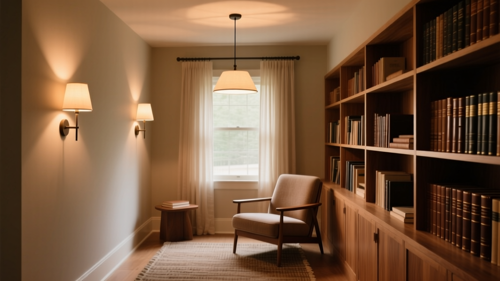
I’ve stood in those nooks at 3 p.m. on rainy Tuesdays—the worst-case scenario for ambient depletion—and watched people settle in like they’d found oxygen. The asymmetric beam doesn’t fight the window light; it partners with it. A 2700K, 400-lumen sconce, aimed precisely at the book’s plane—not the face, not the ceiling—creates a 30° ellipse of illumination that stops just before the reader’s peripheral vision kicks in.
This falls flat when specs are treated as decoration. One site tried retrofitting old symmetric housings with asymmetric lenses—same mounting, same aiming logic. UGR only dipped to 20.1. The fixture isn’t the hero. The *intent* is.
For municipal planners: You don’t need more lumens. You need fewer photons in the wrong places.
For academic facility managers: That quiet zone isn’t “low-traffic.” It’s high-stakes cognition. Light there isn’t ambiance—it’s infrastructure.