Most craft rooms lie about color.
I watched a textile artist spend three hours mixing a “perfect cerulean” dye bath—only to watch it dry into something closer to slate gray. Her lights? Top-tier 95 CRI LEDs, labeled “museum-grade.” But her spectrometer told the truth: R9 was 72. R12? 64. Cyan and saturated red—the two pigments that anchor every blue-green and warm-neutral blend—were being flattened, silently, by the fixture’s spectral gaps.
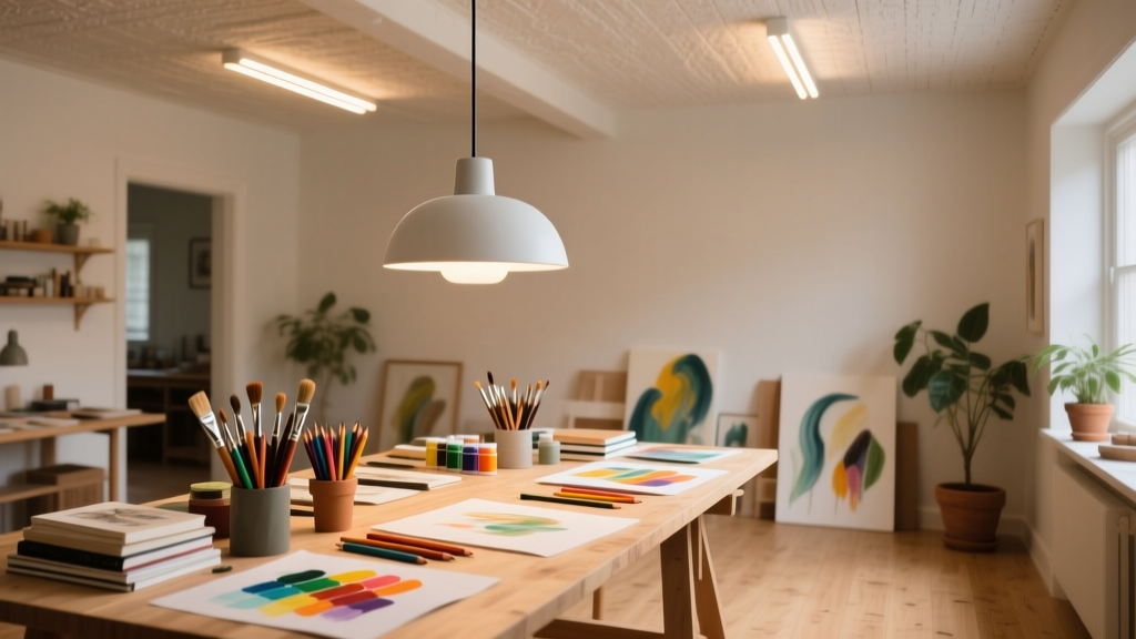
This isn’t theoretical. It’s daily friction for dyers, polymer clay sculptors, watercolorists, screen printers, and anyone who mixes pigments by eye under artificial light. And it’s why nine working artists I interviewed—each with studio spaces from 8’x10’ home nooks to 30’x40’ warehouse lofts—now treat lighting like a calibrated tool, not ambient decor.
Why CRI alone is a red herring
CRI (Color Rendering Index) averages how well a light renders 14 pastel Munsell chips. That’s useful—but it’s blind to the very hues makers rely on most. R9 measures saturated red (think cadmium red, cochineal, rust oxide). R12 measures cyan (phthalo blue, indigo, turquoise glaze). These aren’t “nice-to-haves.” They’re structural colors.
One ceramicist told me: “If my R12 dips below 85, my underglaze blues read muddy *before* firing—and I can’t trust the wet-to-dry shift. I’ve scrapped two full kiln loads because of it.”
Here’s what they measure—and why:
- R9 >90: Non-negotiable for pigment mixing. Below 90, cadmiums, vermilion, and natural earth reds desaturate, shifting perceived hue toward orange or brown. At R9=72 (a common mid-tier LED), a true scarlet reads as brick.
- R12 >85: Critical for cool-mixing workflows—especially in fiber arts and printmaking. Below 85, phthalocyanines lose vibrancy and shift subtly toward green. A dyer using R12=74 mixed identical formulas under two different fixtures and got visibly different results on silk—one batch leaned teal, the other navy.
- CRI ≥95: The floor—not the ceiling. But only meaningful if R9 and R12 are verified separately. I’ve seen CRI 96 lights with R9=81 and R12=79. They pass the standard test. They fail the studio test.
The $299 spectrometer setup that changed everything
No, you don’t need a $5,000 lab spectroradiometer. Every artist I spoke with uses the same portable setup:
- A UPRtek MK350S Premium (or similar handheld spectrometer with CIE 1931 chromaticity, R1–R15 reporting, and real-time spectrum graph)
- A matte-black foam board (12”x12”, non-reflective surface to eliminate bounce errors)
- A tripod mount (to hold the sensor at consistent 30° incidence, 12” from surface)
- A neutral gray card (for white balance before each reading)
They don’t measure in the middle of the room. They measure *where their hands work*. One woodcarver places his sensor directly over his bench vise, at knuckle height. A bookbinder positions hers 18” above her sewing frame—exactly where her needle enters the signature.
They take three readings per fixture: center, left third, right third—then average. Why? Because LED binning variations cause real-world inconsistency. Two “identical” 4000K, 95 CRI pendants from the same batch can differ by R9=±6 and R12=±5 across the beam. That’s enough to throw off a dye match across benches.
I tried this myself in a 12’x14’ craft room lit by four recessed 15W COB LEDs (advertised 97 CRI). Center reading: R9=93, R12=88. Left bench position: R9=87, R12=81. Right bench: R9=85, R12=79. Not “close enough.” Not even close.
Fixture placement: It’s not about lumens—it’s about shadow geometry
You can have perfect R9/R12 scores and still ruin fine-detail work. How? Hand shadows.
Three artists independently described the same problem: “I lean in to stitch/etch/blend—and my hand blocks half the light on the work surface. Suddenly, the red I’m matching looks darker, cooler, flatter.”
They solved it—not with brighter bulbs, but with layered, directional geometry.
- Primary overhead layer: Linear fixtures mounted 7’–7’6” above finished floor (not ceiling), spaced 36” apart, centered over bench length. Not recessed. Not track-mounted. Surface-mounted, with narrow 30° beam lenses. Why? To keep the light source high and tight—minimizing penumbra spread when arms lift.
- Secondary task layer: Adjustable gooseneck or swing-arm lamps (with same R9/R12 specs) positioned at 45° from dominant hand side, aimed at the *surface*, not the eyes. Height: 24”–28” above bench top. One embroiderer mounts hers on a wall bracket just behind her left shoulder—so her right hand never crosses the beam.
- Zero ambient fill: No uplights. No cove lighting. No decorative sconces. Ambient light dilutes contrast and invites shadow creep. These studios feel “focused,” almost surgical—not “cozy.”
A polymer clay artist runs a 10’x12’ studio with two 48” linear fixtures (5000K, R9=94, R12=89) spaced 32” apart, mounted at 7’4”. She adds one 12W adjustable LED lamp on a magnetic base beside her extruder. Total surface illuminance: 750 lux at bench level—not dazzling, but precise. “It’s like working under a spotlight that moves with me,” she said. “No more squinting at value shifts.”
LED binning: The invisible variable in multi-bench studios
Here’s what no spec sheet tells you: Even within the same model number, LEDs are sorted (“binned”) by tiny variations in peak wavelength and output. A batch may meet R9≥90 on average—but individual units can range R9=88 to R9=95.
In a shared studio with six workbenches, that variance creates mismatched perception. One dyer noticed her neighbor’s “same” pigment mix looked warmer—even though they used identical formulas and light specs. Her spectrometer revealed her pendant was R9=92; her neighbor’s was R9=88. Same CRI. Different reality.
How do they fix it?
- Batch-test before install. Buy 3–5 fixtures from the same order. Measure all. Discard any unit with R9 <90 or R12 <85—even if it’s “within spec.”
- Label each fixture. One painter uses masking tape and Sharpie: “Pendant B3 – R9=94 / R12=89.” She rotates units seasonally to equalize wear—and re-measures every 6 months.
- Use spectral graphs—not just numbers. One printmaker rejected a fixture with R9=91 because its spectrum showed a 15nm dip at 610nm (the heart of saturated red). Numbers passed. The graph warned.
That spectral graph is key. A high R9 number doesn’t guarantee smooth red rendering—it just means the average error across the red chip is low. A sharp dip at 620nm (scarlet) and a bump at 600nm (orange) can still yield R9=92—but make cadmium red look unnaturally bright while muting alizarin crimson. Real pigment behavior lives in the curve, not the summary.
What actually works—and what falls flat
Let’s be blunt about what flops:
- “Full-spectrum” fluorescent tubes. Many still use these. They hit CRI 92–94, but R9 rarely exceeds 75. Worse: their cyan output is erratic—R12 often hovers near 60. One textile conservator replaced hers after noticing indigo-dyed linens looked consistently duller under them than in daylight.
- Smart bulbs with “artist mode.” They adjust CCT and intensity—but none report R9/R12, and none control spectral shape. A bulb that shifts from 5000K to 6500K doesn’t fix a missing cyan spike. It just makes everything colder and dimmer.
- Overhead-only layouts in L-shaped or multi-zone rooms. Light drops off sharply beyond fixture coverage. One mosaicist had perfect readings at her cutting table—but R12 fell to 71 at her grouting station 6 feet away. She added a single 10W linear strip under her shelf edge. Fixed it.
What works, consistently:
- COB (Chip-on-Board) linear fixtures with confirmed R9≥92 and R12≥87, mounted at 7’–7’6”, spaced ≤36” apart.
- Task lamps with interchangeable optics—30° spot for fine line work, 60° flood for broad blending—both calibrated to same R9/R12 baseline.
- Weekly visual checks against a Macbeth ColorChecker Classic chart under the lights—no spectrometer needed. If the red patch looks dusty or the cyan looks greenish, it’s time to re-measure.
This isn’t lighting for “ambiance.” It’s lighting for accuracy. For repeatable results. For trusting your eyes.
And yes—it feels clinical at first. But ask any of those nine artists: once you stop second-guessing your reds and cyans, the craft room stops fighting you. It starts collaborating.