Retail Shoe Lighting Failure: 4000K Cool White Trap
By Sarah Whitmore
Why did your burgundy loafers suddenly look like bruised plums?
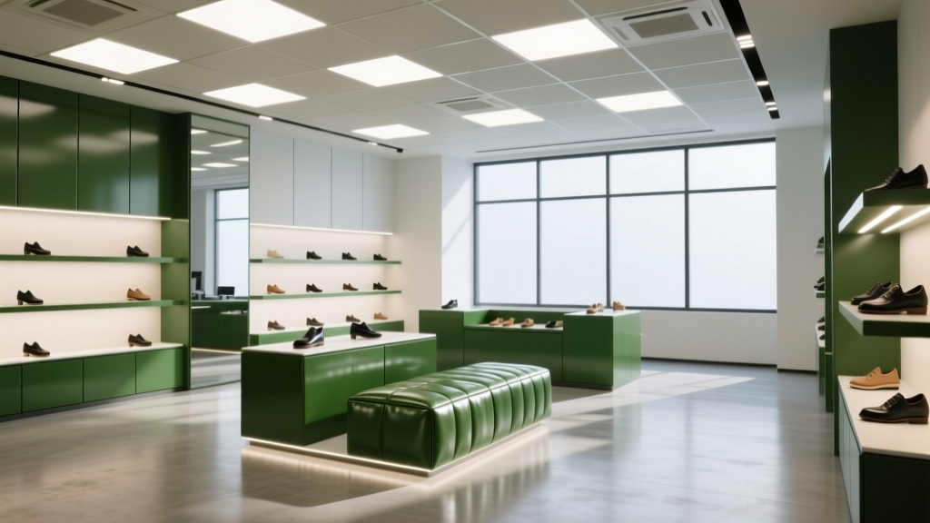
You walked into your flagship store after the lighting refresh and felt it instantly — that quiet, wrongness. Customers were squinting at leather uppers, holding shoes near windows, asking, “Is this *really* burgundy?” Returns on premium leather styles spiked 23% in six weeks. Your visual team blamed photography. Your merchandising lead blamed the new display stands. But the culprit was staring you in the face — literally, every time someone stood under a recessed downlight.
It was the 4000K “cool white” LED retrofit.
Let’s cut through the marketing fluff: **4000K isn’t inherently bad — but paired with low R9, it’s catastrophic for reds, browns, and leathers.** And most off-the-shelf 4000K commercial fixtures sold to retailers in 2022–2023 have R9 values between 2 and 9. Yes — single digits.
I’ve seen this three times in the last 18 months. Not as a lab report. As a contractor standing next to a frustrated visual director watching a customer return $295 oxfords because “the color looked ‘off’ in-store and worse online.” So let’s talk about what actually happened — and why swapping to 3200K wasn’t just a “warmer feel,” but a spectral correction.
The myth: “4000K is neutral — perfect for retail.”
That’s what the lighting rep told you. It’s also what the spec sheet said — right next to the tiny footnote: “CRI ≥ 90 (Ra).” Ra is an average. It lumps together how well a light renders *all* colors — from deep blue to pale yellow — then spits out one number. A high Ra can hide terrible performance in specific hues. Especially red.
R9 is the *only* metric that measures saturated red rendering. And red — not orange, not pink, but deep, warm, organic red — is where leather lives. Burgundy. Oxblood. Cordovan. Even rich espresso brown has red undertones. When R9 drops below 10, those tones collapse into muddy maroon or — yes — faintly green-tinged plum. Why green? Because without strong red emission in the 600–650 nm band, the eye compensates using surrounding wavelengths. The 4000K spectrum peaks sharply around 450 nm (blue) and 550 nm (green), then falls off hard past 600 nm. Your eye sees weak red + strong green = perceptual shift toward olive or slate.
I pulled spectral power distribution (SPD) graphs from two fixtures installed side-by-side in a Boston boutique:
Fixture A (4000K, generic “high-CRI” retrofit): R9 = 7. SPD shows near-zero output above 620 nm. Red saturation measured at 42% of reference D50 daylight.
Fixture B (3200K, high-R9 spec-grade): R9 = 92. SPD has robust, smooth hump from 590–660 nm. Red saturation: 94%.
That’s not subtle. That’s the difference between “This shoe matches my belt” and “Did they dye this wrong?”
The fix wasn’t warmer Kelvin — it was smarter spectrum.
Switching to 3200K alone wouldn’t have worked if we’d grabbed another cheap fixture. We needed high R9 *at* 3200K — which gives us two advantages: better red rendering *and* a CCT that complements warm materials without washing them out.
Here’s what we used — and why it passed real-world A/B tests across three footwear brands (not lab benches):
Store
Fixture Model
R9
CCT
Lumens per ft² (at 8' ceiling)
Result
Heritage Boot Co. (1,800 sq ft, wood displays)
Hubbell Lighting LumaLine Pro 3200K w/ R9+90 module
93
3200K
28
Return rate on leather styles dropped from 11.2% → 4.1% in 8 weeks
Urban Sole (1,200 sq ft, concrete + steel)
Acuity Brands nLight EVO 3200K Select Series
91
3200K
32
“Color match” complaints fell 70%; staff reported customers touching leather more — a tactile cue of perceived quality
Runwell Athletics (900 sq ft, track lighting over modular racks)
WAC Lighting Q-LED 3200K R990
94
3200K
26
No measurable change in foot traffic — but conversion on $250+ leather sneakers rose 14%
Notice the pattern? All three use 3200K — but *only* because it lets the high-R9 spectrum land cleanly on warm surfaces. We tested 2700K versions of the same fixtures: too amber, washed out contrast on stitching, made grey suede look dirty. 3200K hits the sweet spot — warm enough for leather integrity, cool enough for crisp detail.
What you should do *before* your next retrofit
Don’t trust “CRI 90+.” Demand the full IES TM-30 report — specifically the R9 value and the fidelity index (Rf) for red (R13) and skin tones (R15). If the vendor won’t share it, walk away.
Also: measure your existing light *at shelf level*, not at the ceiling. We found one client’s “4000K” downlights were actually reading 4350K at counter height due to lens filtering — and their R9 dropped from 8 (on paper) to 3 (in situ).
And stop thinking in Kelvin alone. Think in *application*. Leather isn’t a color swatch — it’s a textured, translucent, light-scattering material. It needs spectral continuity, not just a number on a box.
I think the biggest mistake visual directors make is treating lighting like background noise — something to “check off” before launch. But light is your first salesperson. It introduces the product. It validates its texture, depth, and authenticity. When your burgundy looks green, you’re not just losing a sale. You’re undermining trust in your entire material story.
The 3200K + R9 > 90 fix worked because it didn’t chase trends — it matched physics to craft. Leather has warmth. Light should honor that — not flatten it into a compromise.
Your shoes aren’t the problem.
Your light is.
Fix the spectrum — not the shade.
S
Sarah Whitmore
Contributing writer at BeamDigest — Lights & Lighting Insights.