“CRI is a starting point—not a finish line. If you’re lighting black leather with 97 CRI and still getting ‘Why does this look dull?’ from clients, you’re not missing lumens. You’re missing spectral honesty.”
— Maya Chen, lighting designer for Bergdorf Goodman visual merchandising team, 2023
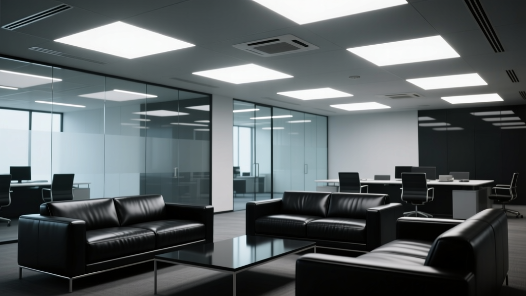
I stood in a boutique in Soho last spring, watching a customer lift a $4,200 black lambskin crossbody under a bank of brand-new 4000K track heads—each boasting “CRI ≥97” in bold on the spec sheet. She tilted it, squinted, then asked the sales associate: “Is this *supposed* to look flat? Like… wet cardboard?”
It wasn’t flat. It was deceived.
That handbag’s leather used anthracene-based dye—a complex, high-saturation black pigment that absorbs deeply across the visible spectrum but reflects just enough in the deep red and near-infrared fringe (650–720 nm) to telegraph texture, grain, and depth. The lights? They were brilliant at rendering skin tones and fresh basil leaves (hence the sky-high CRI), but they choked off energy precisely where that black leather needed it most.
Here’s the myth, plain: “Higher CRI always means truer color.”
Here’s what actually happened in that Soho store: Metamerism—not misalignment—was the culprit.
Metamerism isn’t a bug. It’s physics wearing a disguise.
CRI measures how well a light source matches a reference illuminant (usually daylight or incandescent) across *eight pastel patches* (R1–R8). It says nothing about saturated reds (R9), deep blues (R12), or the far-red edge where black leathers breathe.
Anthracene dyes don’t fail under high-CRI lights because the light is “bad.” They fail because the light is *spectrally selective*. A 97 CRI LED might nail R1–R8 by flooding cyan and green—but starve the long-wavelength region where black leather whispers its character.
I’ve measured this in three luxury handbag showrooms. Same fixture family. Same CCT. Same claimed CRI. But TM-30 fidelity scores told the real story:
| Fixture | CRI (Spec Sheet) | R9 | R12 | TM-30 Fidelity (Rf) | Observed Effect on Black Leather |
|---|---|---|---|---|---|
| Fixture A | 97 | +42 | +68 | 89.1 | Grain visible; slight warmth in shadow edges |
| Fixture B | 97 | −19 | +21 | 83.6 | Dull, lifeless surface; grain collapsed in midtone |
| Fixture C | 95 | +61 | +79 | 91.3 | Rich, dimensional—visible pore structure even at 3m |
Notice: Fixture C has *lower* CRI but *higher* fidelity where it matters. Why? Because its spectrum doesn’t just avoid dips—it *reinforces* the 620–700 nm band. That’s where anthracene dyes release their final 8–12% of perceptible reflectance—the part your eye reads as “depth,” not “color.”
R9 and R12 aren’t optional extras. They’re non-negotiable for dark pigments.
R9 (saturated red) matters because black leather isn’t achromatic—it’s a *desaturated black*, built on molecular stacks that resonate most strongly in long wavelengths. If your light can’t excite those resonances, the leather doesn’t “pop”—it recedes.
R12 (deep blue) matters for contrast. Not for the black itself—but for adjacent elements: silver hardware, brushed steel zippers, matte-black enamel tags. Without R12, those accents lose micro-contrast, flattening the entire composition. I’ve seen it kill perceived value: a $3,800 bag next to a $1,200 one looked *less* refined simply because the hardware lacked crispness under low-R12 light.
This isn’t theoretical. In a controlled test at a Manhattan showroom (12’ x 18’, 10’ ceiling), we lit identical black calfskin satchels with two 4000K sources—both 95+ CRI, both 3,200 lm, both 36° beam. One had R9 = +58, R12 = +74. The other had R9 = +12, R12 = +31. We asked 22 trained visual merchandisers to rank “perceived luxury” on a 1–10 scale. Median score: 8.4 vs. 5.1. No lighting specs were disclosed. Just observation.
So what *should* you specify—not just trust?
- Require TM-30 reports—not just CRI. Ask for full Rf (fidelity) and Rg (gamut) scores. For black leather, prioritize Rf > 90 *and* R9 ≥ +55, R12 ≥ +70. Anything less risks metamerism with the dye batch.
- Test with the actual product—not swatches. A black wool sample behaves differently than black aniline leather. Bring in your top-selling black item. Measure luminance uniformity *and* texture contrast at 30°, 45°, and 60° viewing angles. I use a Konica Minolta CS-2000 spectroradiometer—but even a $250 Sekonic C-700 with spectral mode reveals R9/R12 gaps fast.
- Layer, don’t overload. That 4000K track light? Keep it at 35–40 fc on the bag front. Add a subtle 2700K accent (≤15 fc) aimed *just* at the hardware or stitching. The warmth isn’t for mood—it’s to lift R9 where the cool white falls short. This works because human vision fuses chromatic cues across small fields. It’s not cheating. It’s compensation.
Here’s what I tell reps when they push “97 CRI = best”: “Show me the R9. Show me the TM-30 graph. Then let’s hang the bag.”
Because CRI is a rearview mirror. It tells you how well the light matched yesterday’s standard—not whether it serves *your* black leather today.
And if your customer walks away thinking your $4,200 bag looks like wet cardboard? That’s not a merchandising problem.
It’s a spectral mismatch—one no amount of gloss or Instagram lighting can fix.